Completion Year: 2020
Location: Tainan
Completion Year: 2020
Location: Tainan
品味私廚 -以料理空間打造視覺與味覺的饗宴
Kitchen in Style: A feast of vision and taste presented by culinary space
當代人對美好生活的追求,逐漸從傳統的物質層面拓及至精神層次,對日常質感的嚮往體現在個人五感經驗的滿足上,比方由視覺出發拓及至嗅覺與味覺的全新飲食體驗,便是對新生活詮釋的方法之一,講求細緻、小編制教學,著重交流互動的廚藝教室也在這樣的背景下應運而生。本案位於台南市東區,為當地最熱鬧、繁華的市中心區域,以傳統透天街屋構成的社區內,沿路遍布4-5公尺高的挺拔喬木,勾勒出青蔥蓊鬱,鬧中取靜的城市街景。由年輕夫婦與三名孩子共組的二代家庭,便居住在這個鬧區裡的40年老屋。從事餐飲教育事業的男主人在既有的校園教學之餘也在自宅開設私廚,教導鄰近社區的媽媽們做料理,團隊透過適度的空間設計改造,打造符合現今住商混用需求的私廚教學場域,為老宅重新賦予新生。
Compared to the past, a contemporary pursuit of one's better life had gradually extended from a substantial improvement to a spiritual level. The personal taste, therefore, is reflected in their sensory satisfaction. For example, a brand-new diet experience that is enhanced from visual to gustatory and olfactory stimulation is one of the ways to interpret modern life. Under such a background, a small-format culinary workshop that emphasized details and interactions had been born.
This project is located in the Eastern District of Tainan City, the most prosperous downtown area. A young couple and their three children living in the community composed of traditional townhouses, with arbors along the road giving their 40-year-old house a green yet peaceful streetscape. While the male host setting up a private culinary workshop for neighborhood moms beside his catering education career, CHU-Studio was engaged to optimize the layout, bringing a new aspect to the old house.
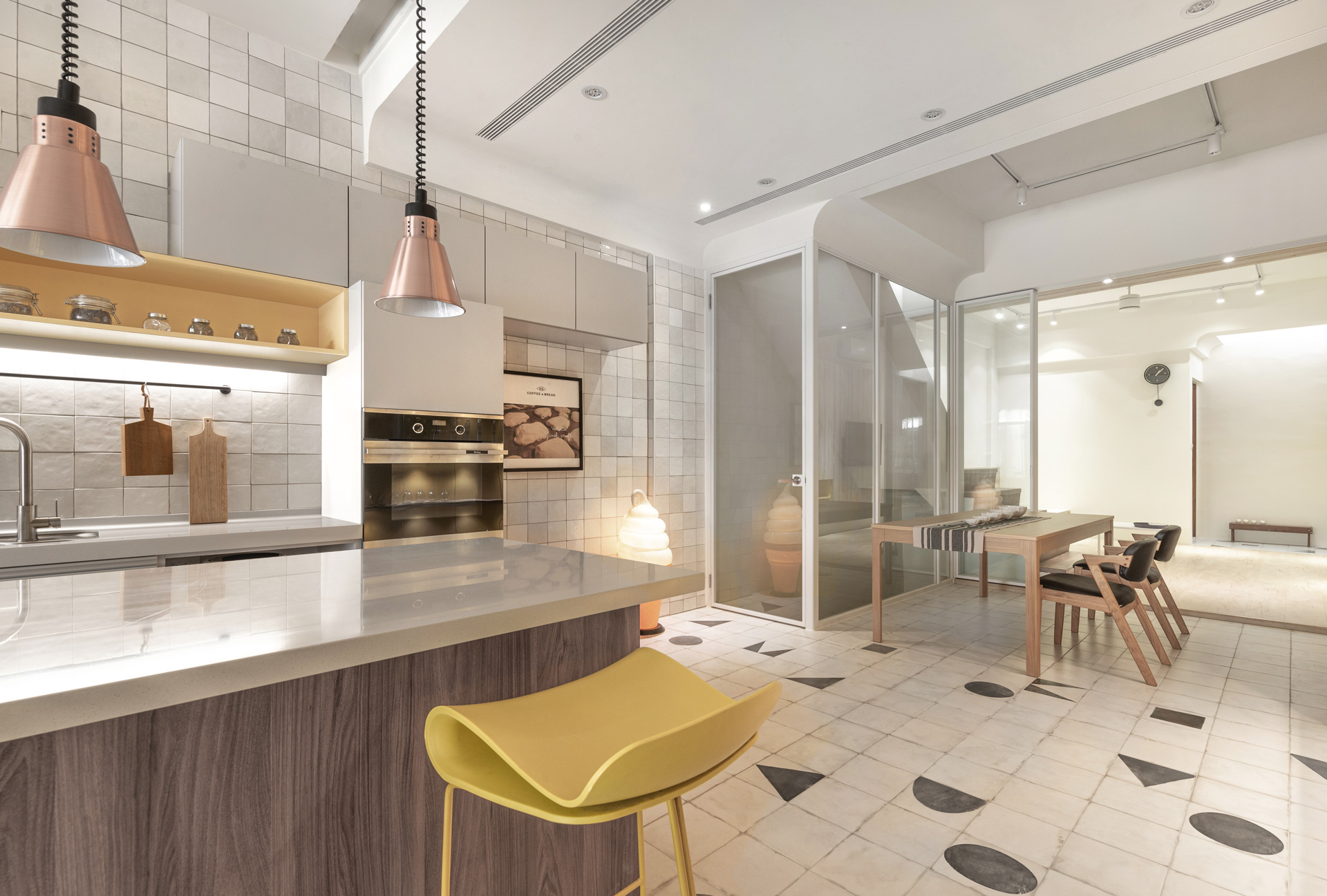
氛圍塑造-在狹長平面打造明亮、輕盈的色澤
Shaping the atmosphere: Brighten the narrow space
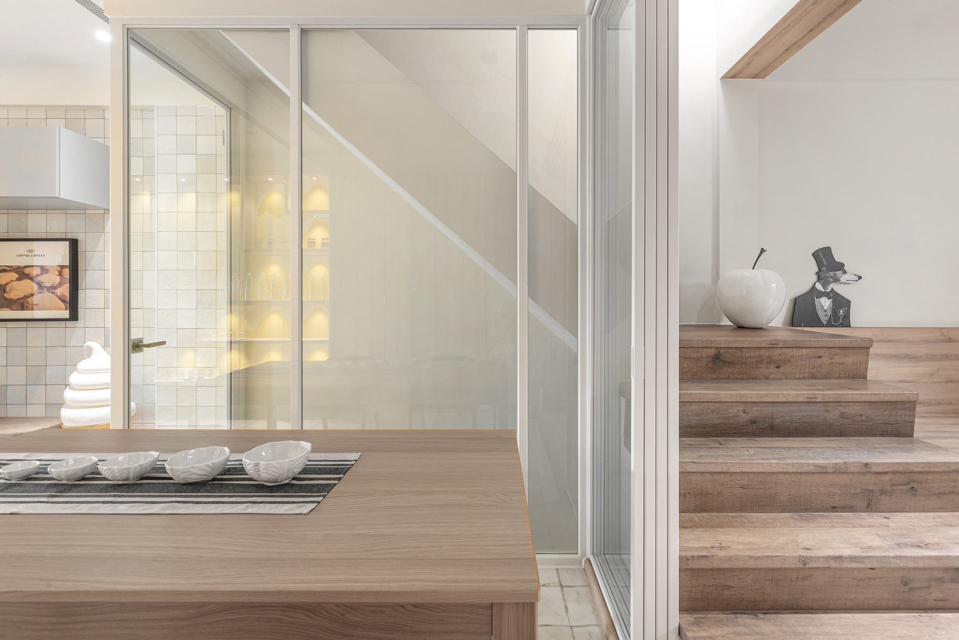
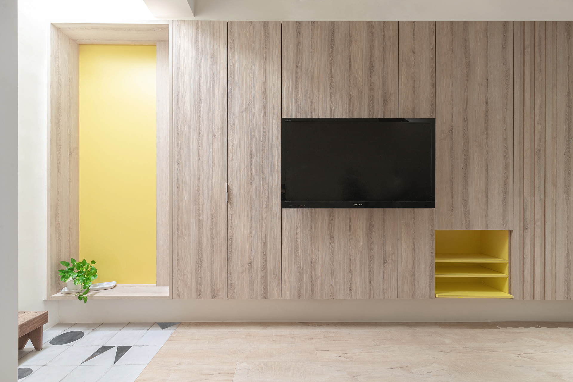
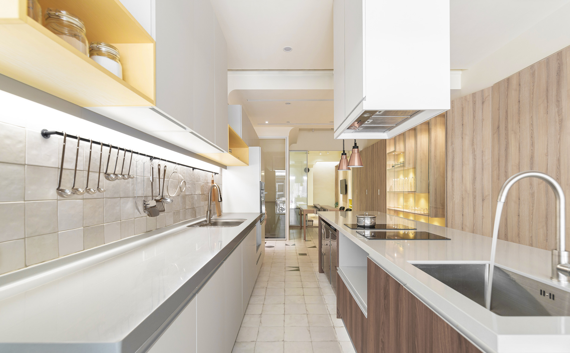
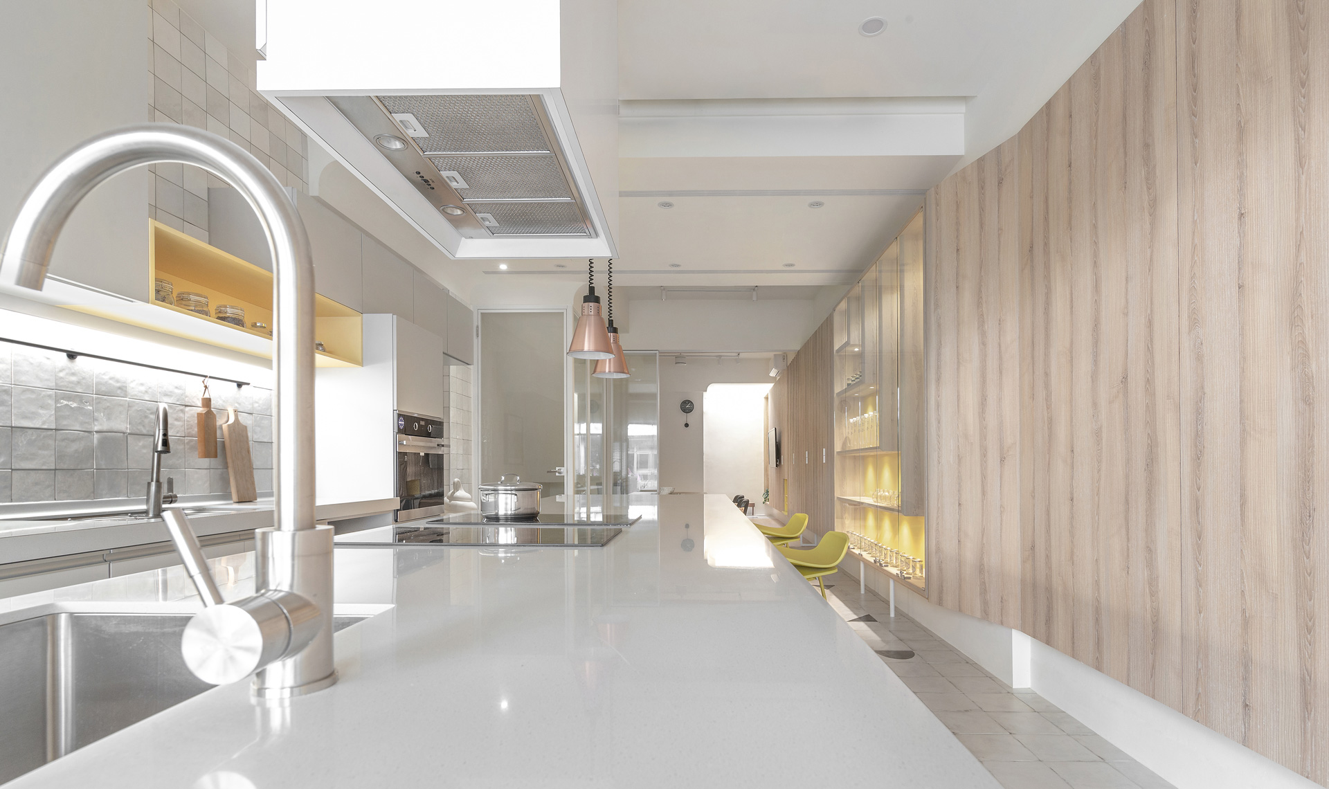
私廚教室主要包含三種不同的課程類型,包括主打廚師做給你吃的食用課程、主打親自身手作的學習課程,以及主打親子共學的家庭輕食課程。基地保有傳統舊式街屋面寬窄、縱深長的特色,設計上以大量淺色木質調的素材為主體,搭配白色系的天花與廚具系統櫃,為室內整體營造通透、輕盈的質地,並改善狹長型平面先天採光不佳的問題。在原始木料與白牆的搭配中,透過擺置部分鮮黃色烤漆櫃體與中島吧檯椅,藉此在極簡、現代的場域內營造跳躍的靈動感。此外,位於室內中段靠牆的垂直梯間,亦拆除既有的封閉隔間,改以透明玻璃光盒圍繞,透光的材質,在保有牆面分隔公共活動與私人住所的區域界定之虞,也能讓寬度僅有4米餘的長向室內創造明亮、几淨的氛圍。
The base retains a characteristic of traditional which is short on width but long on depth. This layout, however, makes it suffering in poor lighting. A large number of wooden materials in a light tone were implemented against this issue, with white ceilings and kitchen modules installed to create a transparency texture, some bright-yellow-painted cabinets and barstools were also applied to draw a contrasting yet vivid picture in this modern and minimalist space.
On the other hand, existing walls around the staircase in the middle of the house were replaced by glass-made partitions, enabling the public and private areas to be separated while keeping the brightness. With all these delicate transformations, the sense of brightness was successfully be ensured within this 4-meter-wide space.
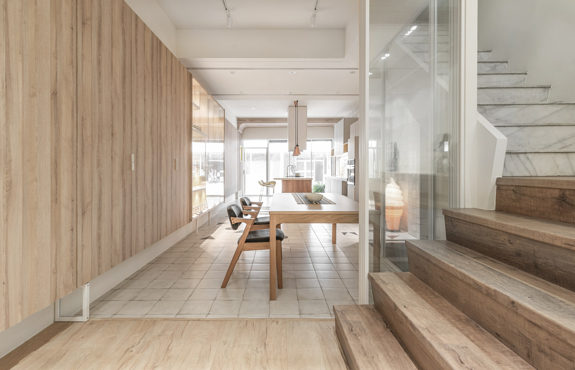
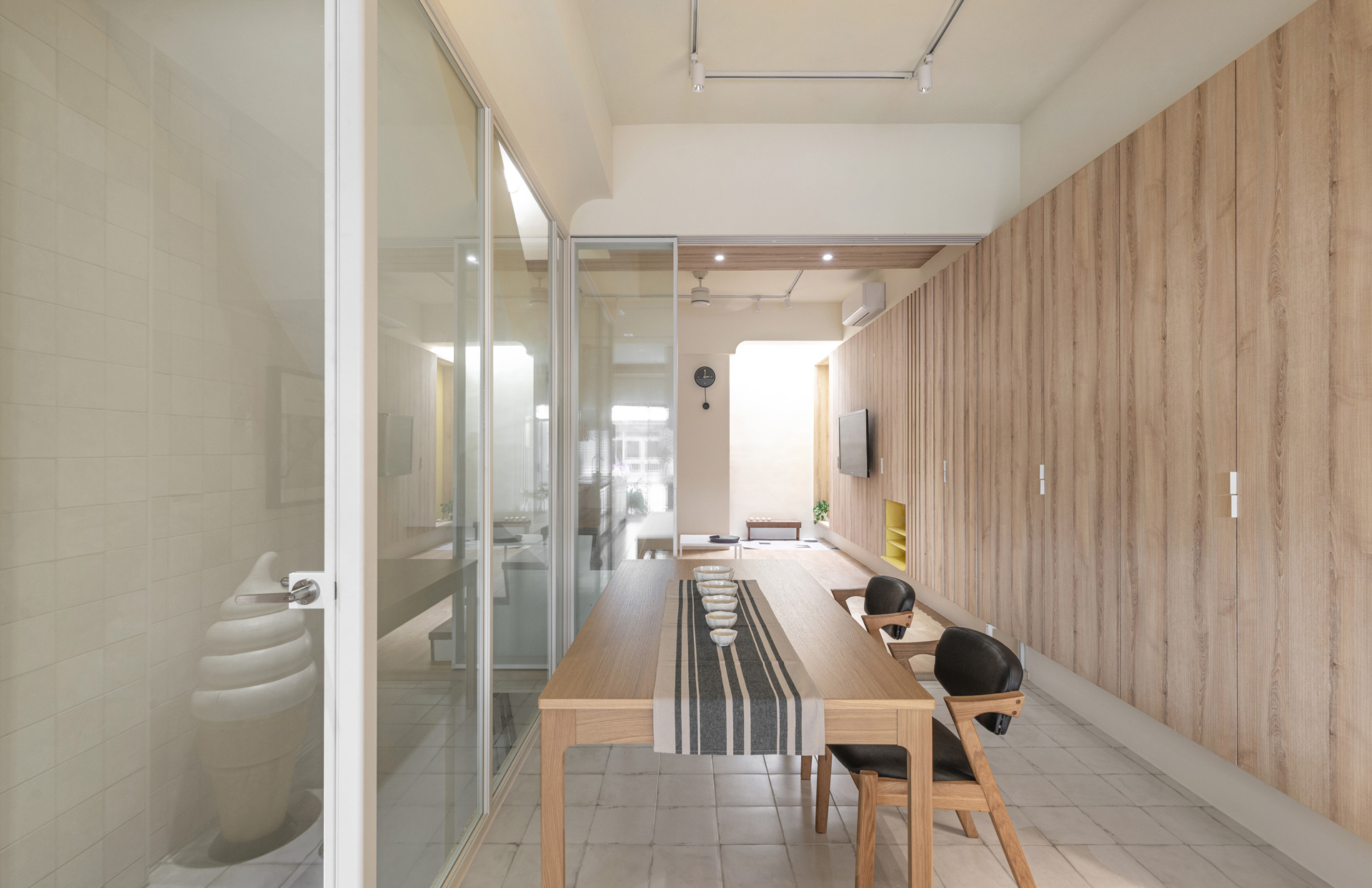
重構布局-滿足多樣化使用的彈性配置思維
Replanning the layout: Being flexible to meet diversified usage
因應不同課程的空間使用需求,在空間平面佈局上,團隊也改變傳統客廳在前,廚房在後的配置模式,將結合文教機能的廚房移至前端,居家使用的客廳挪至後方,中段與梯間相連的部分則做為用餐區,以便課程能因應不同參與人數與規模大小,彈性調整桌椅排列與課堂空間樣態,以滿足多樣化的授課、用餐、公私運用。開放式設計的空間中,分別於前、中、後三個交流互動的空間界域(網美打卡牆、食材販售區、廁室空間),以散置的幾何造型藝術地磚鋪面,及牆面延伸至天花板的一體式木作設計,暗示無形的空間邊界,並藉由空間區位調整,讓主動線得以由入口一路貫穿至後方廁室,結合以玻璃推拉門重塑的玄關,讓開放式設計延伸了室內空間的視野。
※本案特別感謝知名手工鬆餅霜淇淋店AWK 2 Go出借黃色吧檯椅拍照,有空到台南可以到AWK 2 Go坐坐,品嘗幸福的滋味!
The culinary workshop offers three kinds of courses, including the mini master class to experience the dining, the in-depth course that cooking with the chief, and the family workshop to learn with children. In response to those different needed, designers reversed the traditional convention to set the living room behind the multi-functional kitchen and defined the middle sector as the dining area. With this new configuration, space could be flexibly adjusted according to various scenarios, members, and the scale of events to switch between commercial and private usage.
Among this open-plan spatial, designers set social spots at the front, middle, and back sectors (which are image wall, ingredient shelf, and lavatory, respectively) as the separation of the sections, and further used random-placed geometric floor tiles and unibody wood-made cabinets to imply the notion of shapeless boundary. Combining the redesigned configuration of sectors and transparent front door; thus, the core traffic flow could be outlined clearly from the entrance all the way to the backside.
