Completion Year: 2015
Location:Chengdu
Completion Year: 2015
Location:Chengdu
城市地景
Urban Landscapes
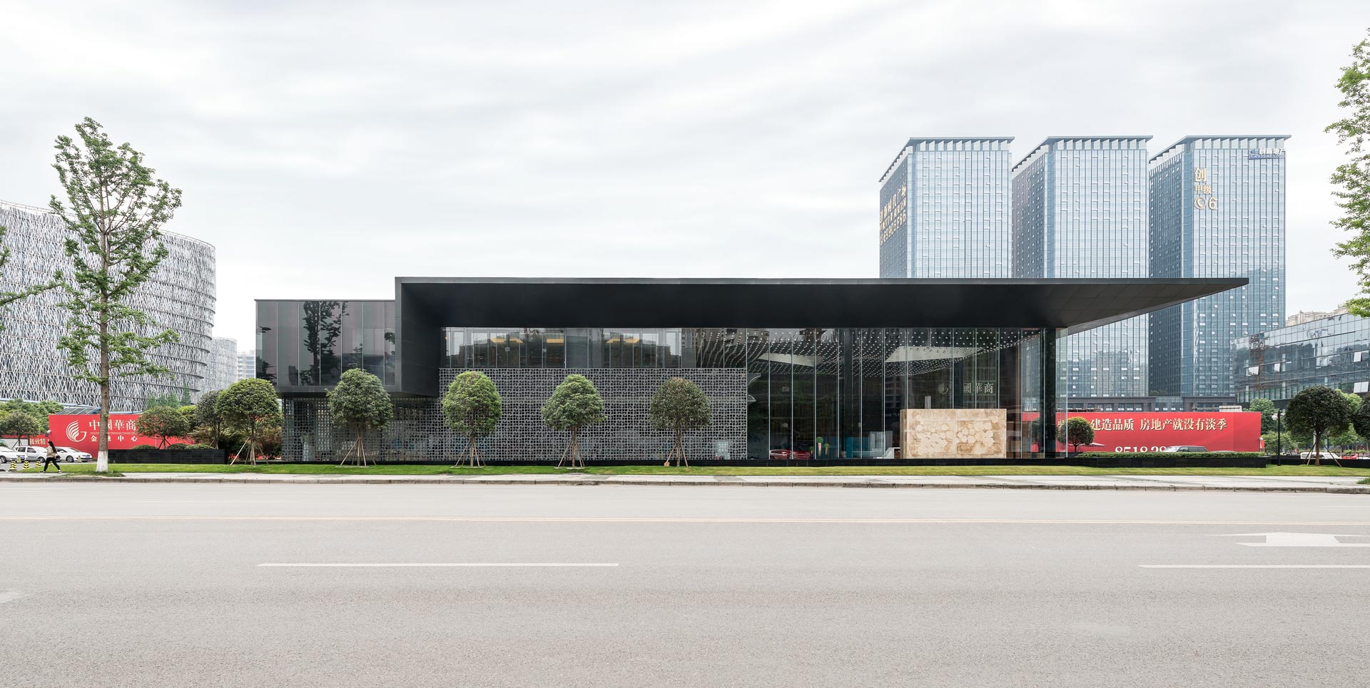
本案位於四川成都市高新區,是中國華商集團(China Eminent Chinese Businesses)的銷售會館,整體建築是由三道不同質感的牆體所開始架構,再透過強調水平線條感的平屋頂覆蓋,和週圍強調垂直發展的建築群相比,輕巧利落的線條所衍生出的微建築,優雅的氣度更創無限的想像空間。我們將建築視為一都市的地景,一個巨型的裝置,也是一個生活事件的載體。透過大尺度的立面開窗、虛介質牆體的置入、懸挑八米出簷所創造出的半戶外空間、環繞建築週遭的水體等,企圖藉此手法軟化建築的邊界(edge),進而有效導入藝術、創意、生活、行動、品牌等事件,進而將建築提昇成為一個都市的敘事(scenario)載體,一個容納市民活動之都會容器。
This project is located at Gaoxin District, Chengdu City, Sichuan Province and is a sales center for China Eminent Chinese Businesses. The building starts with three layers of walls built by three different materials then covered with a long flat roof which emphasizes horizontal lines. Comparing to its vertically accentuated neighbors, it is a lightweight micro-architecture that provokes elegance and imaginations. We see the architecture as an urban landscape, a massive device and a medium for life-events. Through the extensive 8-meter-height glass walls and the surrounding water, it softens the edge of the building and more effectively introduces events of art, creativity, life, mobility and branding into it. This approach promotes the building as a medium for urban scenario and a container for its citizens.
強調工藝性的室內地景
Emphasizing for Interior Landscapes and Craftsmanship
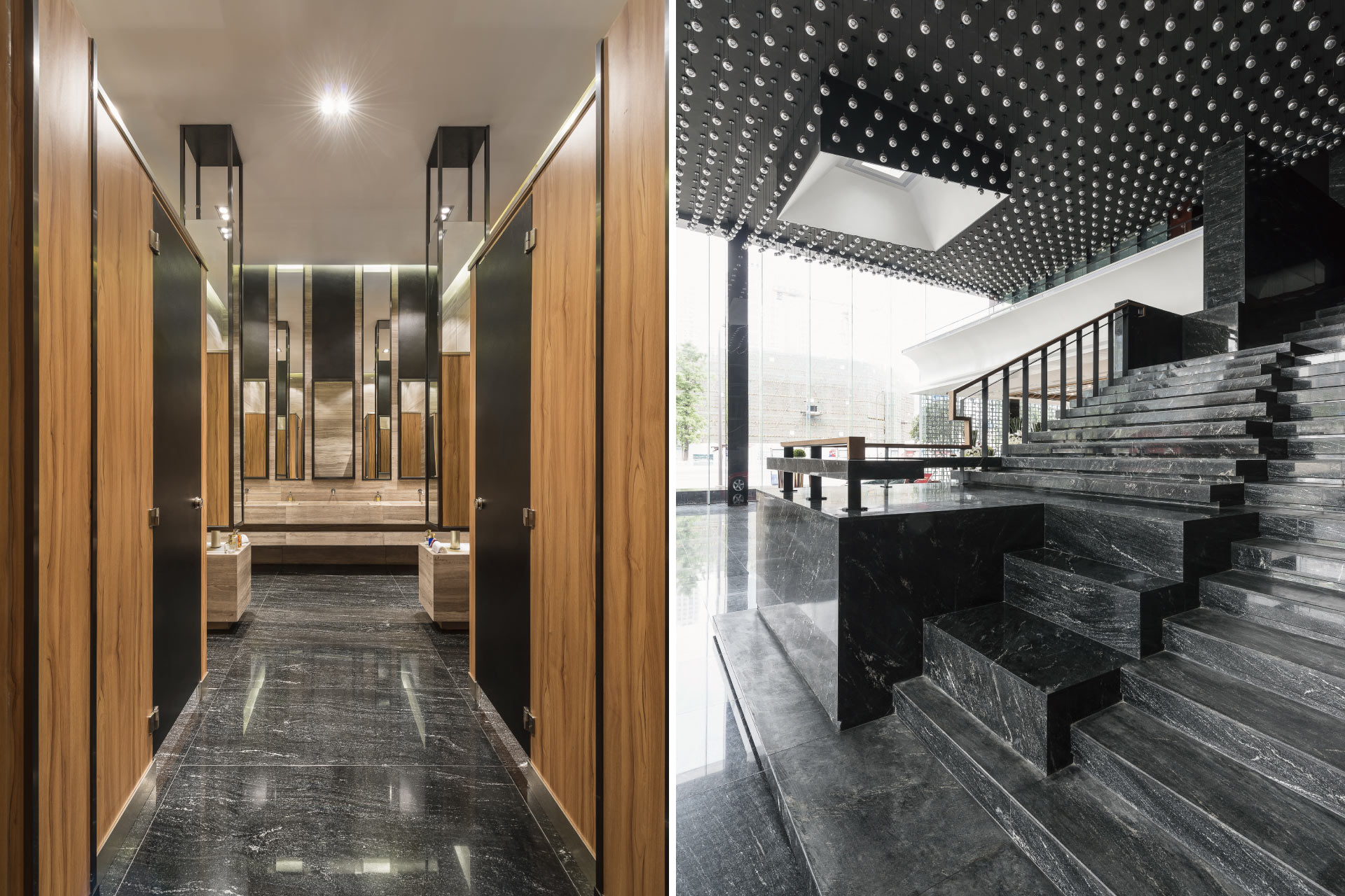
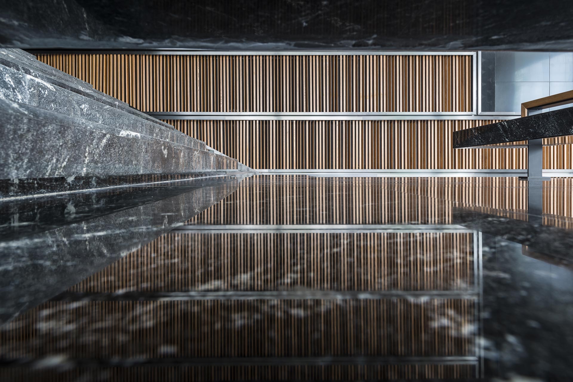
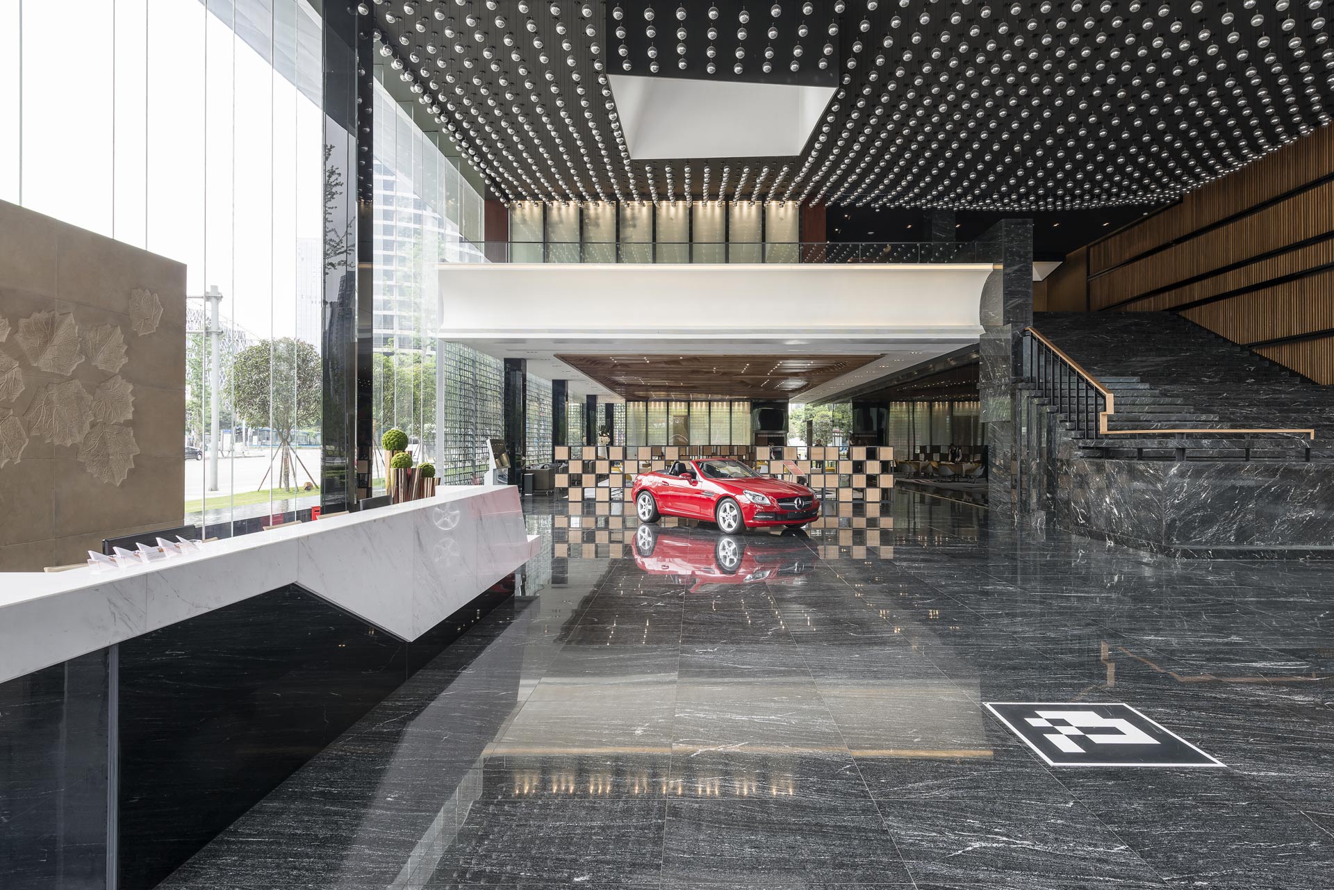
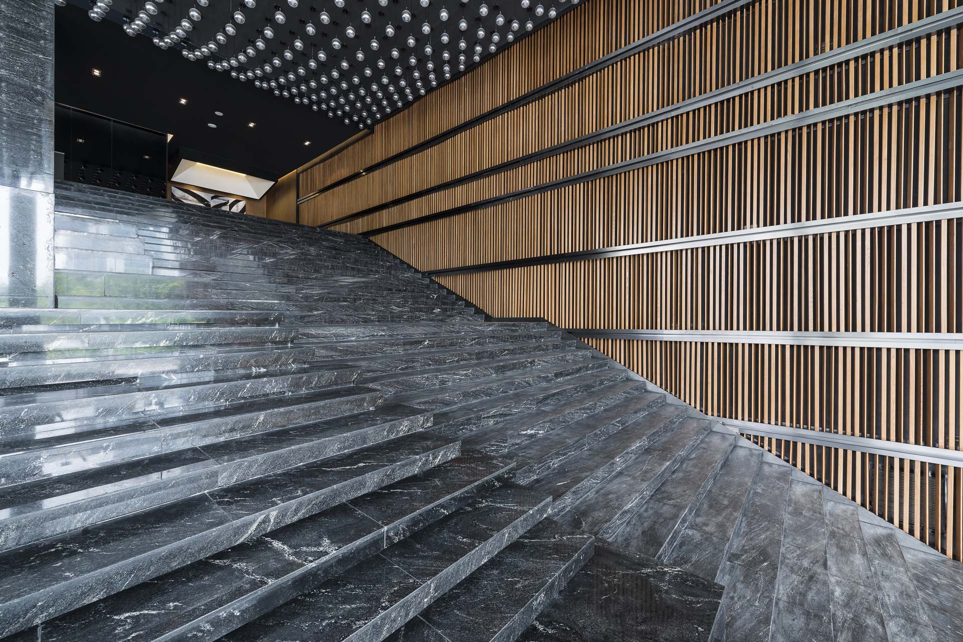
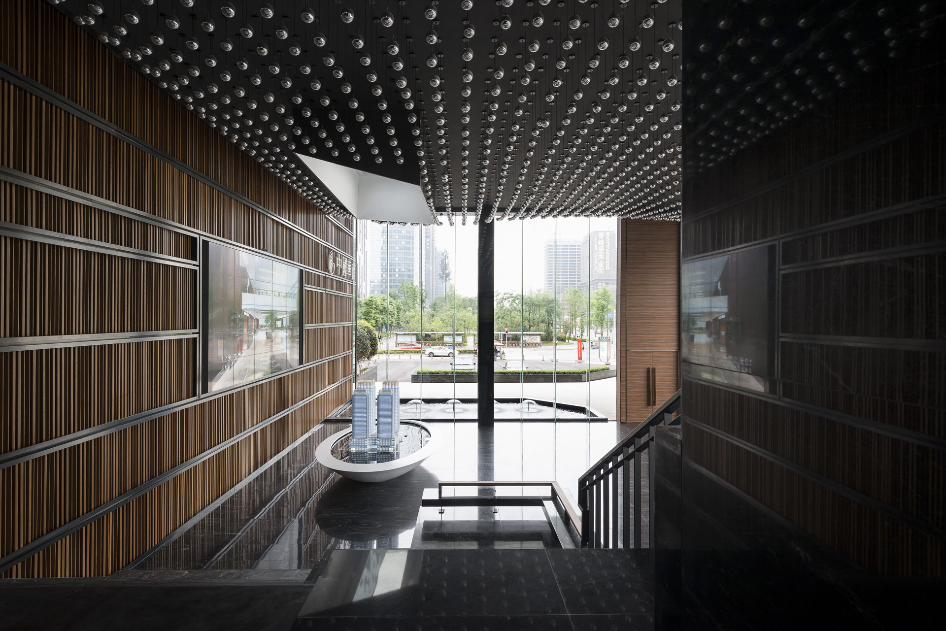
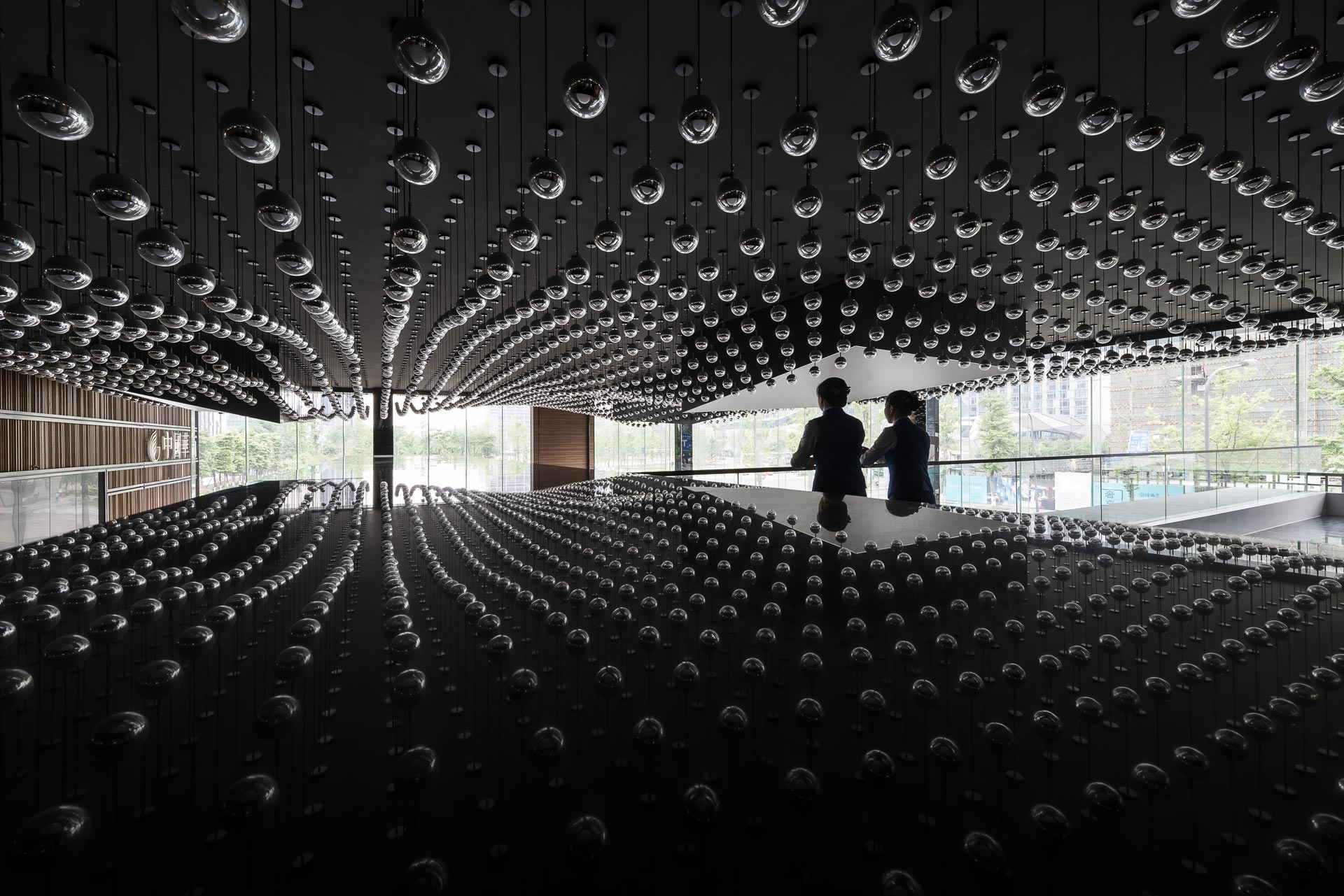
我們將室內的空間物件視為室外地景的延伸,並強調其工藝性(crafting),不將空間的物件視為單一元素,而企圖將其轉換成一室內的地景。大廳天花的部份開了四個天井將外部光線導入室內,並透過3200顆的訂製燈具,透過數位等差的運算創造出如雲彩般的燈海,輕盈剔透的玻璃珠在白天與夜晚都有著迷人的折射效果。另外,底端高十米的牆體,是透過由三角形斷面隨機運算所構成的一數大成美的既莊嚴又富趣味的視覺端景底牆。主樓梯的設計也是相同的理念,將展演舞台融入,創造出可配合活動使用的地景舞台樓梯,側面的收邊是透過不同進出面的構成來處理,透過細節的處理更說明了團隊對於工藝性的追求。
We see the interior spaces as the extension of the exterior landscapes and emphasize craftsmanship. We try to redefine and transform single objects into elements of this interior landscape. For example, the ceiling is opened with four atriums to allow more light in, and through the installation of 3200 pieces of light on the ceiling, it creates a digitally calculated sea of lights; the glasses of the lights shine throughout day and night. On the other hand, the 10-meter-height wall at the end is designed through triangulate parametric calculations and forms a large repetitive pattern wall. The main stairs also inherit the same idea that it incorporates a staging area that can be used with the stairs. The finishes on the side are done by different concaved surfaces which indicates the emphasis on craftsmanship.
介面的解構與再定義
Deconstruction and Redefinition of Interface
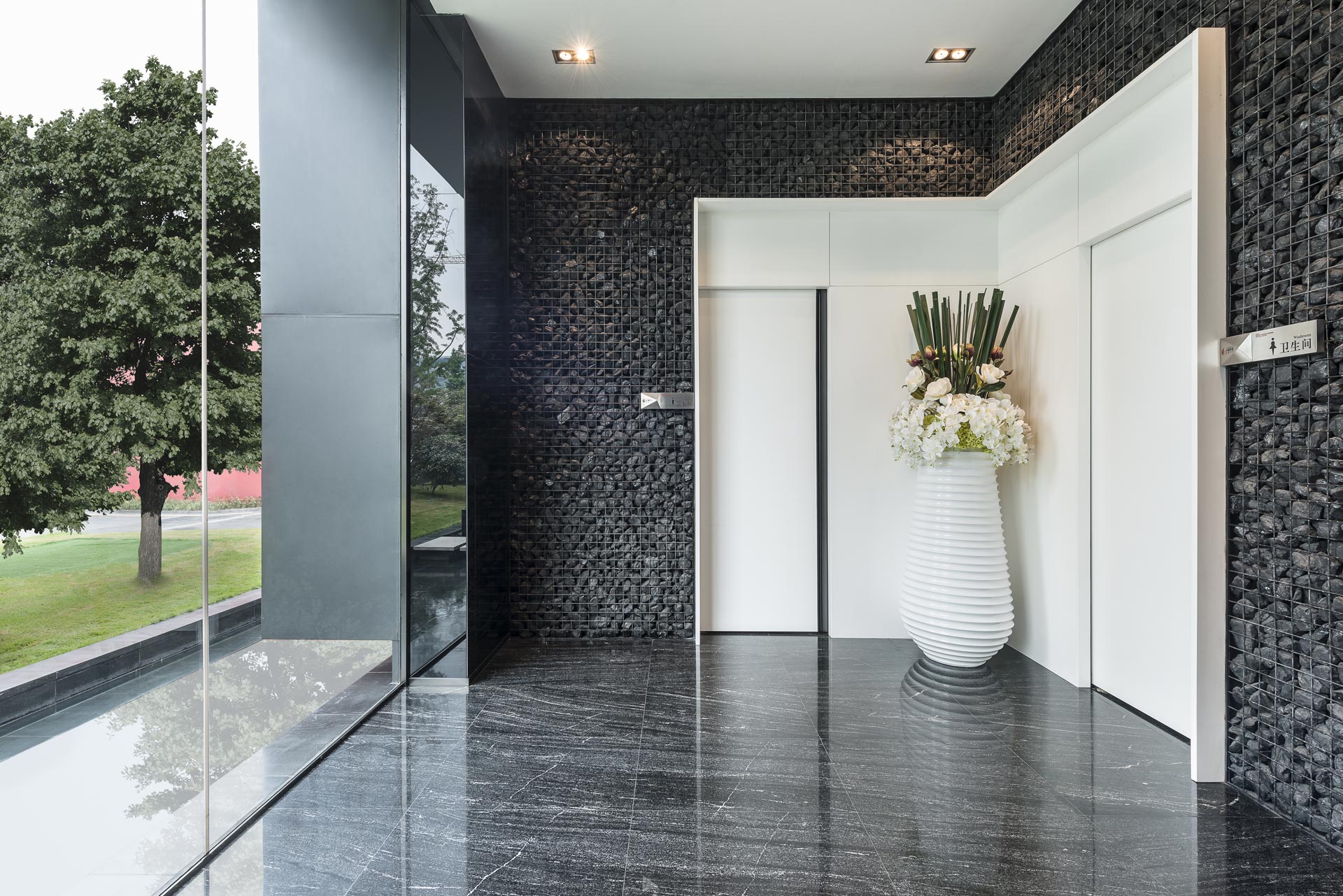
在整體空間設計上我們企圖透過解構與再定義來回應當代追求的藝術性與曖昧性,例如在男女廁所的平面布局上都有「兩進」的設計,透過第一進的「擋」來緩合空間和增加私密性;而入口設計的部份則透過一「L」的造型將平凡無其的門共構成一整體,弱化「門」的元素而強調「入口」的意象,也解構再定義了傳統認知上對於「門」的定義。
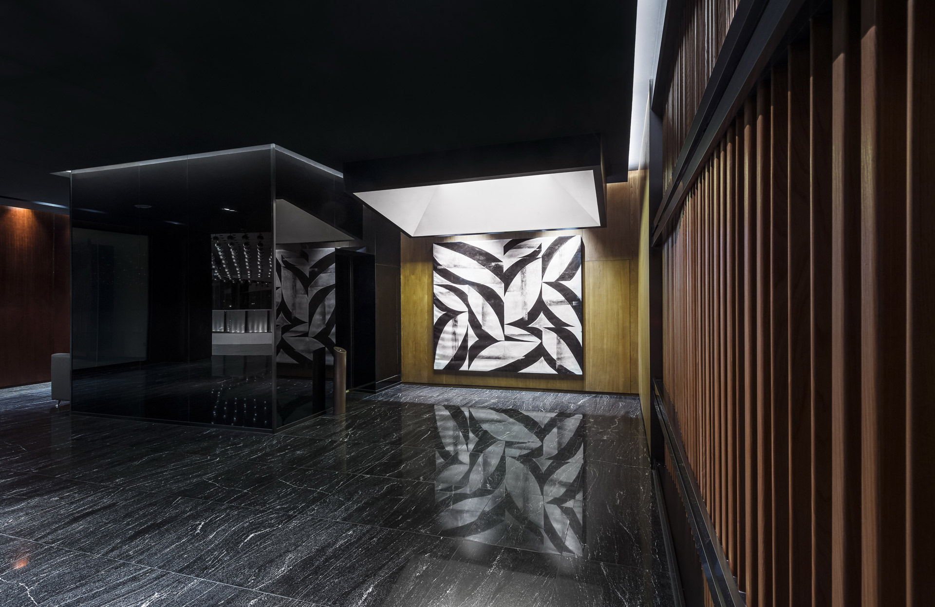
對於「牆」這個空間中的重要元素我們也有許多想法,比如一樓會談空間旁的第三道主牆體是將「中國華商集團」的「華」字,將其簡體字轉譯後再随機運算所創造出一虛介質,既連結又阻隔內外間的對話。再者,二樓的會議室的主牆面,我們更直接使用了數位控制的電膜玻璃,設計上我們將會議室的正面放在參觀動線的視覺端景上,透過感應電膜玻璃產生的實虛變化來回應參觀者的活動,當牆體的虛實開始與使用者互動,若隱若現的介面重新詮釋了內與外、私與公的關係,重新定義了「牆」這個重要的空間元素。
On the whole of this architecture, we aim to deconstruct and redefine the space in order to respond to the artistic and ambiguous features of contemporary design. For instance, each of the bathrooms has a “double entrance” design there are in-between spaces between doors which aim to increase privacy and ease the transition when entering. The main entrance is an L shape design that links the male and the female bathroom entrance together. It is an act of deconstructing the conventional sense of the doors and visually redefining them as a single entrance.
For the walls, we take a word from the name of China Eminent Chinese Businesses and transform the word into an abstract shape then use it as the pattern of the grille wall. In addition, we choose to use electric film glasses on the main wall of the conference room on the second floor. The wall is right on the visual pathway and the electric film is able to respond to the action of the audience. When the glasses start to interact with the users, they redefine the relationship between the inside and the outside, public and private; furthermore, they redefine the essence of the wall.
區域感的塑造
Defining Zones
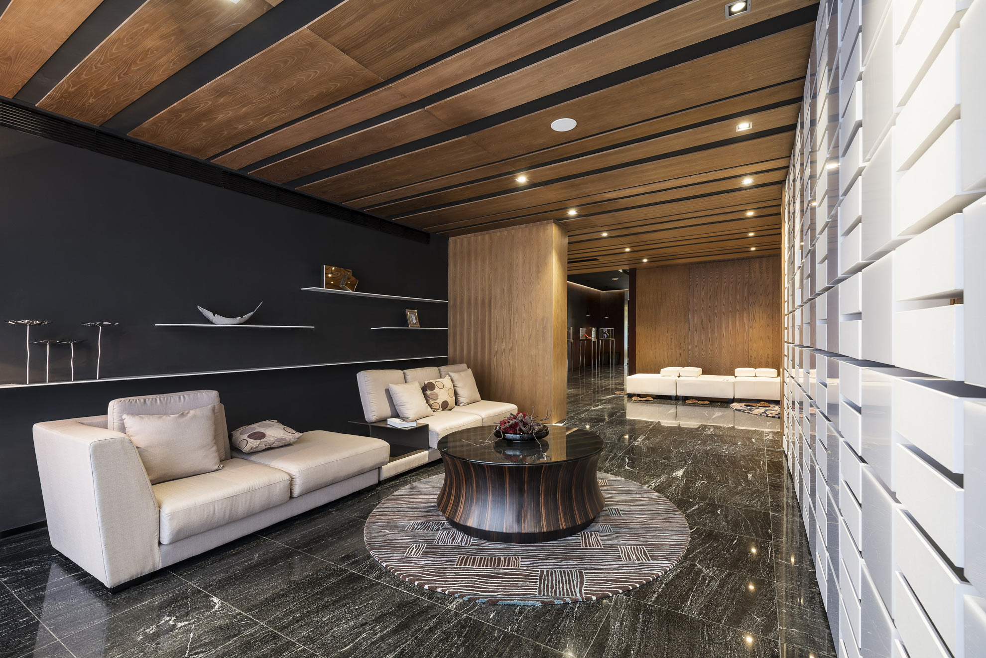
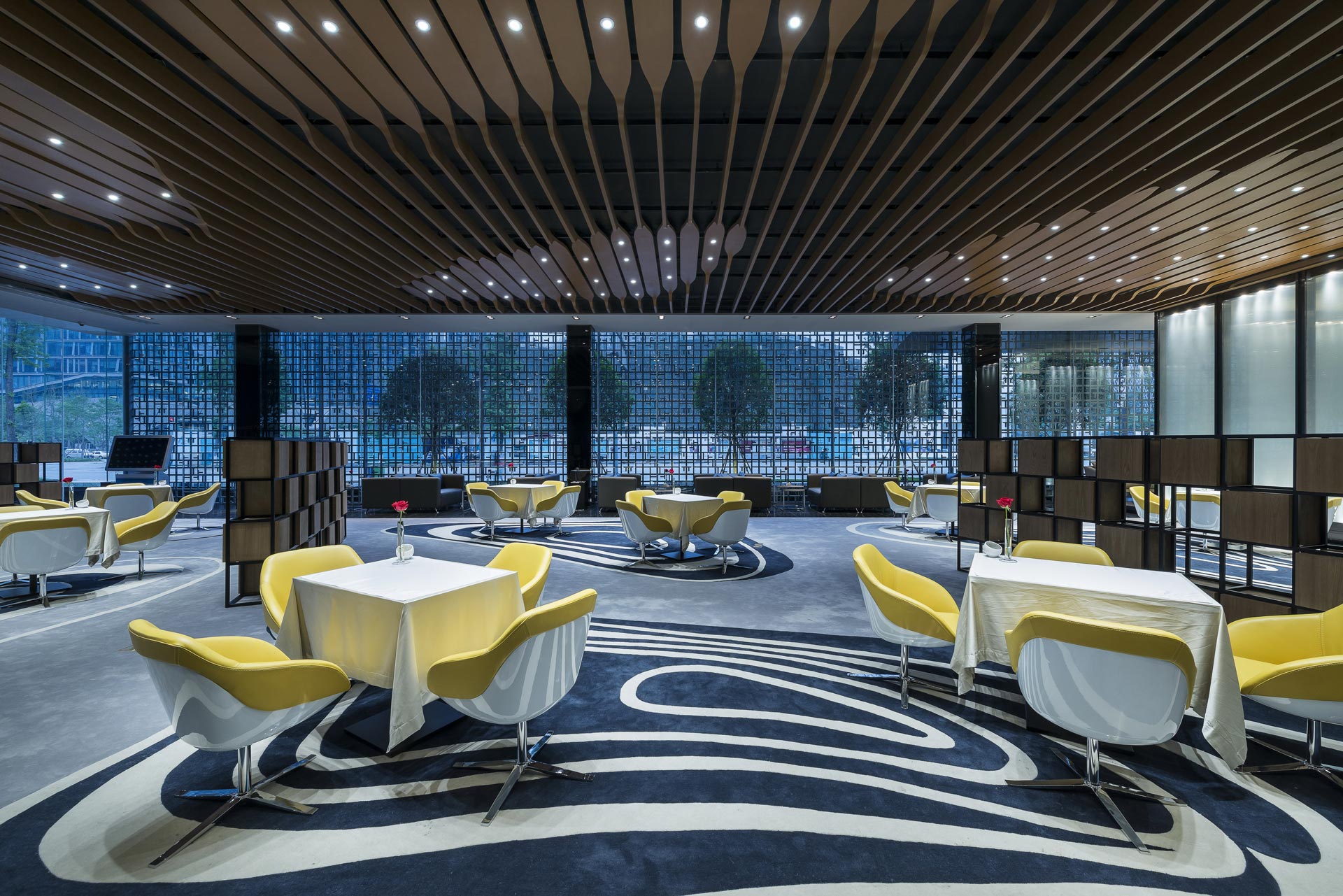
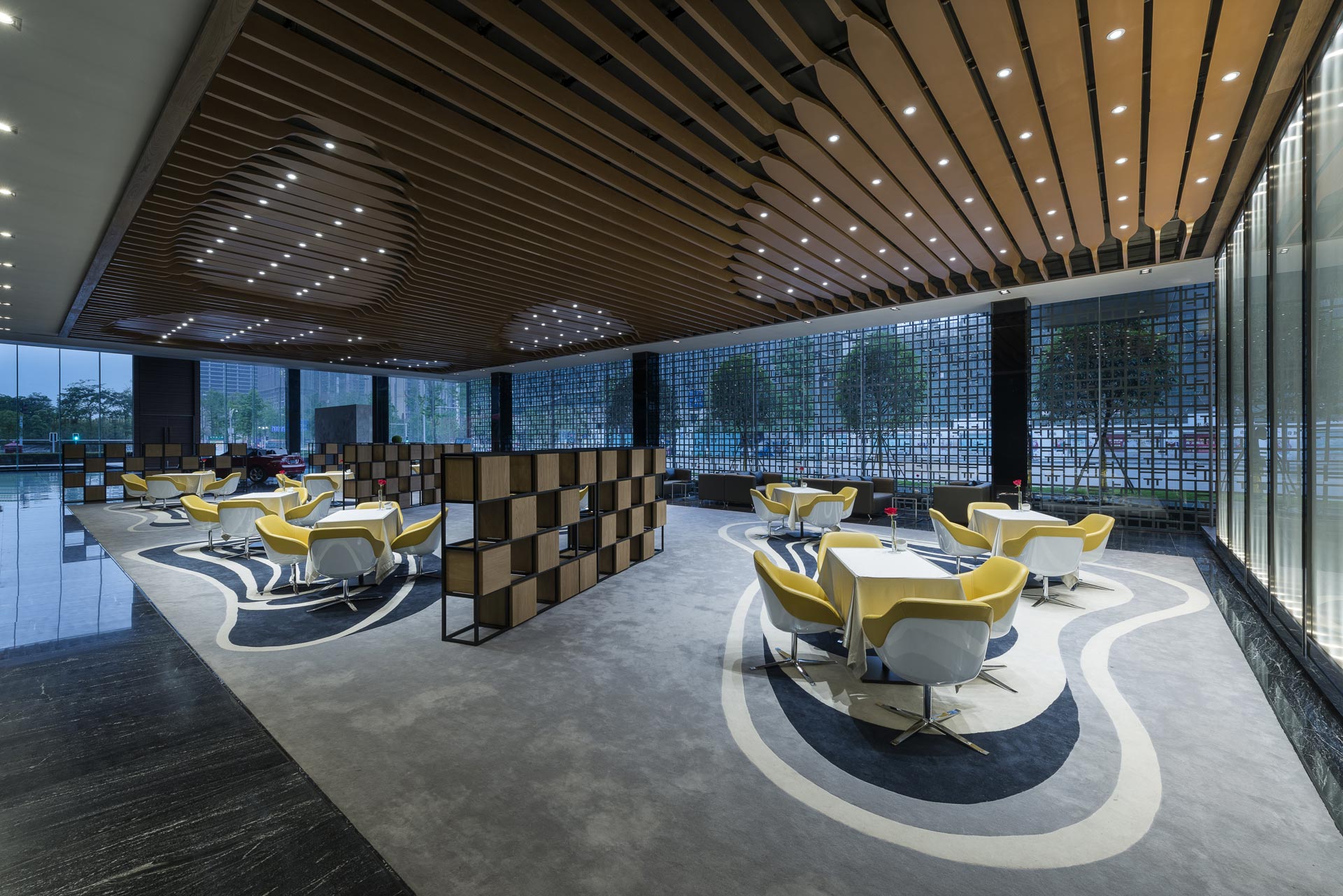
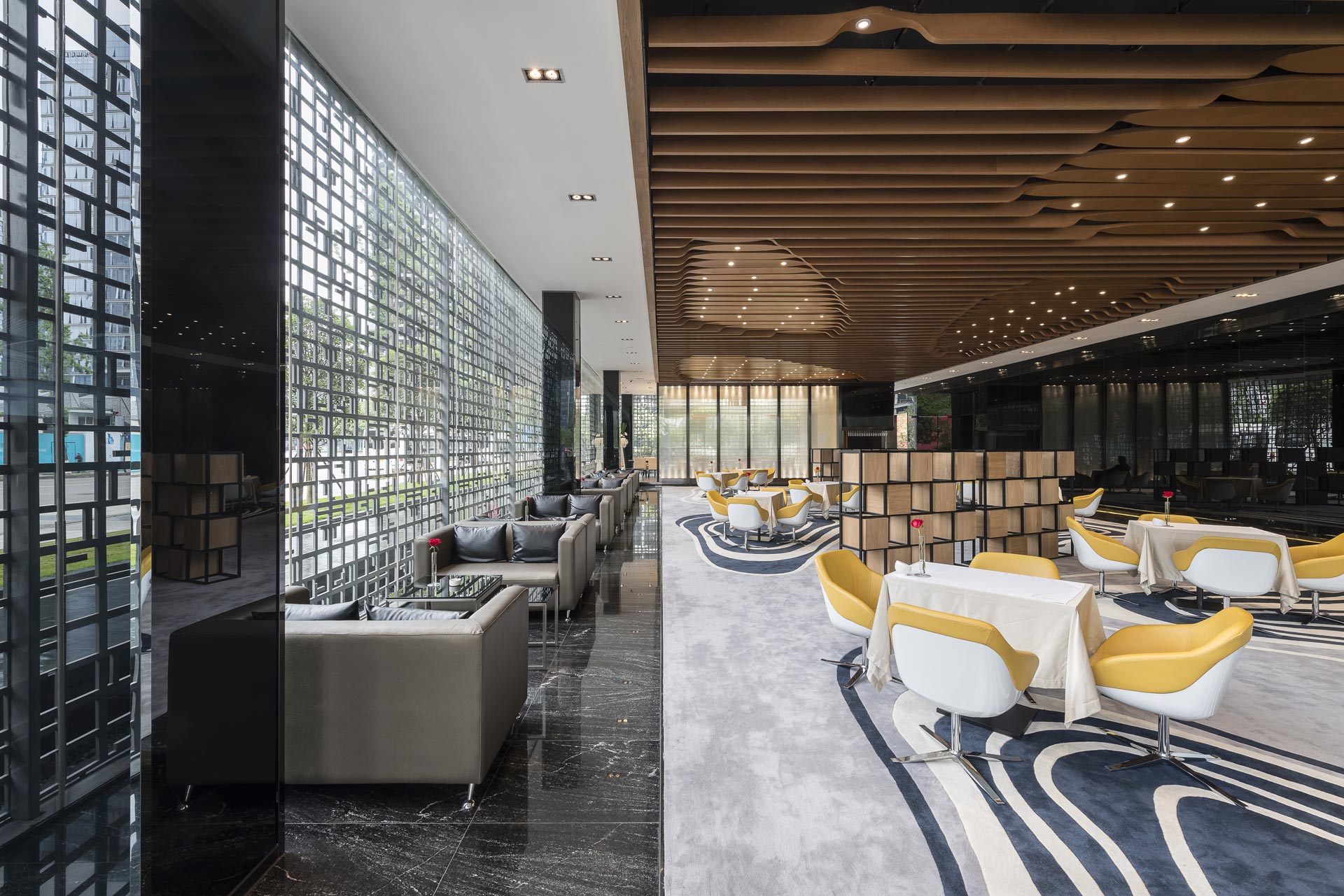
設計上我們也相當注重區域感的塑造,區域不一定是以實體的界面來區隔,我們透過對於「連結性」的操作,也就是讓空間的平面布局與空間元素間的相互對話,比如會談區的造型天花,形式上內退的造型配合空間家具的布局和地毯紋理(pattern)的設計,透過三者間的相互呼應,架構其網絡的關連,進而定義了「區域感」(zone)。同樣的在大廳的天花設計也是相同的理念,四個天井的位置都回應了下方平面上重要的空間單元,透過連結性的手法,就能夠在單一均質的大空間中創造出場域的主從關係(hierarchy)。因而,我們認為當代的設計思維應該是一個面狀的網絡,應從過去對單一物件的操作轉換為對關係的思考,將網絡視為是一種設計敘事(scenario)的方式。
We also stress the sense of “zone” with interior planning. A zone does not have to be defined by physical barriers; it can be defined through connections. For example, the meeting zones are incorporated with the changes in ceiling shapes, the pattern of the carpet, and the placement of the furniture. The zones are therefore defined by the linkage of these elements. There are functional zones placed under the four atriums on the ceilings as well. By incorporating these techniques in design, a seemingly single large space can have hierarchies in it. All in all, we think contemporary design is about networking; the conventional thinking of a single object should be extended to the thinking of the relationship between objects and seeing the network as a way of defining design in spaces.
