Completion Year: 2020
Status: Built
Completion Year: 2020
Status: Built
海港高雄-空間內外綿延的港市繁景
Harbor in Kaohsiung – Harbor City Living of Spatial Continuity
高雄,作為南臺灣的核心都會,以環太平洋港灣城市的基底,商業港埠與工業發展為主軸,完整劃一的矩陣型都市規劃,大型綠帶公園與新型態文化設施的建設,形構充滿流動感的海洋都會形象。本案即高雄都會區內的新建高層住宅,緊鄰衛武營國家藝術文化中心,為近年快速崛起、發展的區域。位於17樓高的基地擁有雙向大面積的落地窗景,遼闊視野除了將港市合一的壯麗海港都會景緻納擁入懷,更可近距離觀賞老樹、水波環繞的衛武營,及全球最大單一屋頂劇院-以榕樹的樹冠造型為意象所設計的主體建築。我們以屋外景觀延伸,通透於室內為目標,思考空間動線與採光規劃作為本案設計的起點。
As the major metropolitan area of southern Taiwan, Kaohsiung embodies commercial harbor and industrial development based on the traits of Pacific-Rim Harbor City. The image of flow ocean urban is formed by modern city grids, large green-belt parks, and contemporary cultural amenity infrastructures. This project is a new high-rise residential building in the Kaohsiung metro area, adjacent to the Weiwuying National Kaohsiung Center for the Arts. It is located at one of the most rapidly developed areas in recent years. On the site, a seventeen-floor residential building exists with full-height windows looking out to the spectacular views of harbor and city as well as the world’s largest single roof-structure performance hall is renowned for its fig-tree canopy symbolic gesture. The design project is creatively anchored on a spatial continuity between the external views and the interior, and coupled with spatial circulation and natural lighting planning.
開放設計-質感與溫潤兼備的家居之所
Open Design – Residential Living of Quality and Warmth
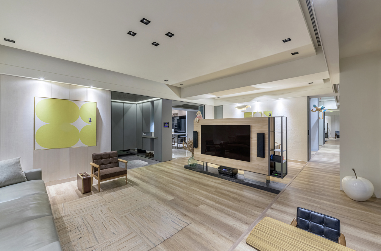
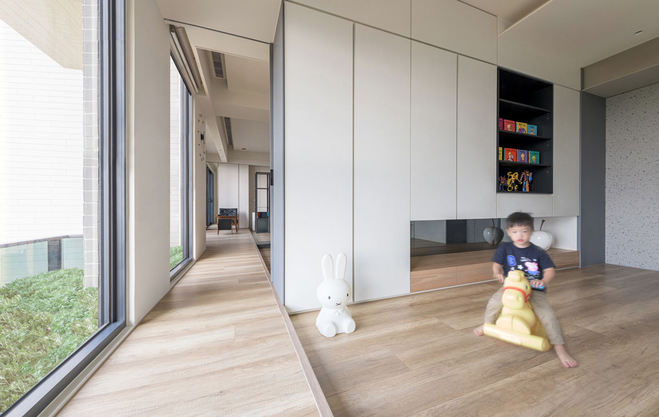
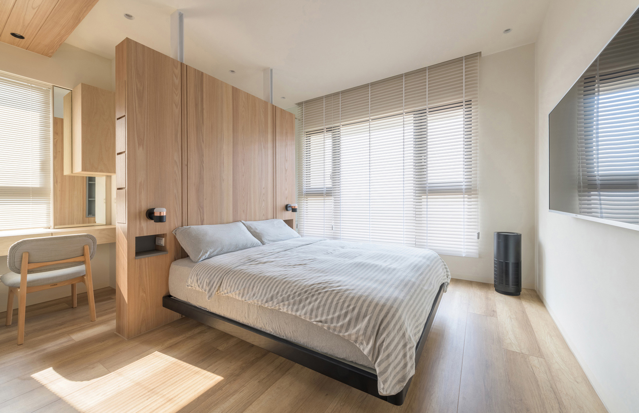
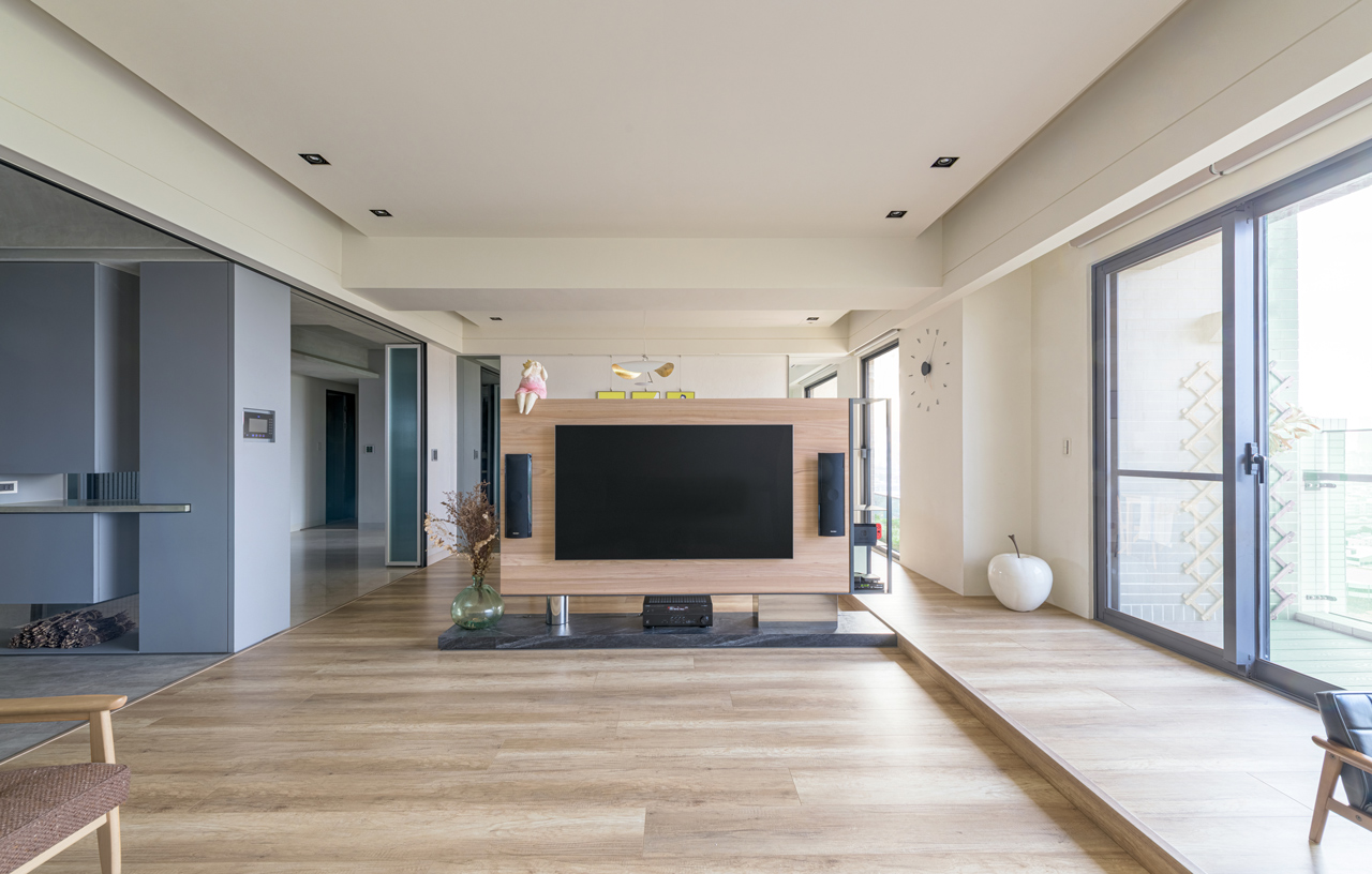
開放式空間設計、多用途的空間運用模式與簡化的動線設計構成了設計的三大面向,尤其是將面對衛武營的正立面打開,植入一條通透的「室內平台」(走廊),有效串聯了外部陽台,也連結了客廳、餐廳與多功能房,創造出一個開放明亮的生活的場域,並模糊了內外的界面,將室內的尺度延展聯結到戶外氛圍。在材質上,以灰、白雙色的色彩搭配為基調,水泥粉光、貼皮木作與金屬構件為主要材質,在木質的溫潤與混凝土及金屬的冷調中,調和出兼具當代設計美學,亦包容居室溫馨氛圍的家宅。空間區分為公共活動區與臥室空間,自平面中央的玄關登堂入室,採開放設計的公共場域,將門廳、客廳與餐廳與複合廚房空間連成一氣,均勻地分布於主動線兩側,動線後方則為臥房與浴廁空間。位處兩個主要區域之間的孩童房,我們藉由雙開口設計形塑為半開放式場域,一方面強化空間的流動性,亦可令雙向落地窗的和煦光線灑遍室內各個角落。
Open Space Design, multi-purpose spatial usage model and simplified circulation design constitute the three main cornerstones of this design project. Especially the elevation facing Weiwuying National Kaohsiung Center for the Arts is opened up to incorporate an “Indoor Platform,” a corridor effectively links the external balcony with living room, dining room and the multi-purpose room in a symphony of open and well-illuminated living spaces that blurs the boundary between the exterior and the interior. In terms of materiality, the grey-on-white dual-color base tone, monolithic finish concrete, timber veneer, and metal pieces are the main material choices for a contemporary residential design aesthetics in a blend of warm timber, concrete, and metal materiality. As the interior consists of the public activity areas and the private bedrooms, the procession starts at the unit entrance in the center of the floor plan into the open-design public areas of the interconnected lobby, living room, dining room and kitchen evenly distributed on both sides of the main circulation axis which leads to the bedrooms and the bathrooms. The children’s bedrooms are located in between the public and the private domains, and feature with a dual-door access design in a semi-open area, which not only enhances the spatial flow but allows the two-way full-height windows to inundate every corner of the interior with ample natural lighting.
多元流域-兼融公私需求的空間運用
Diverse Flowing Domain – Spatial Usage of Public and Private Duality
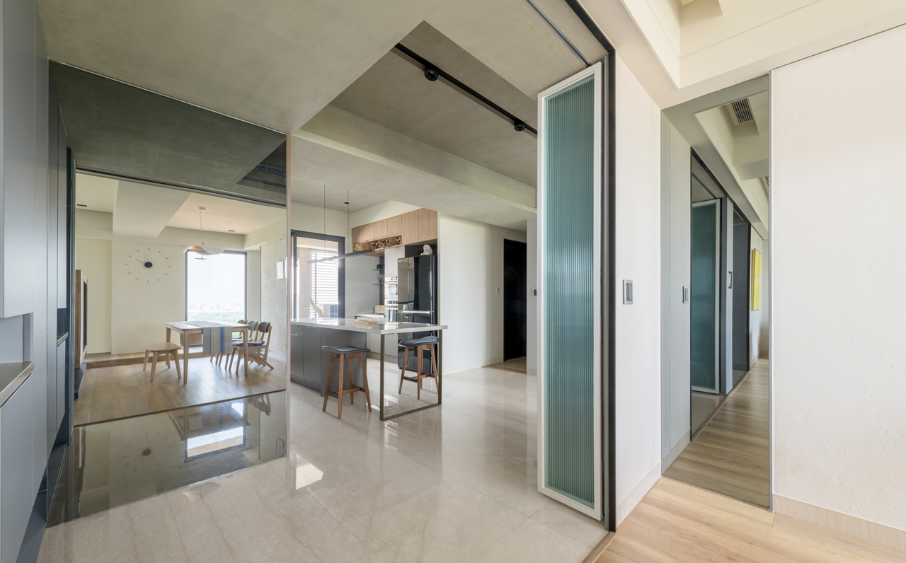
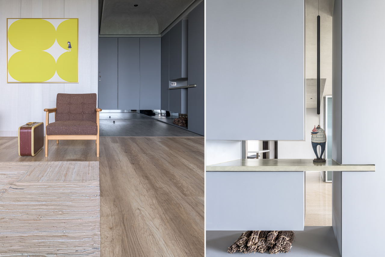
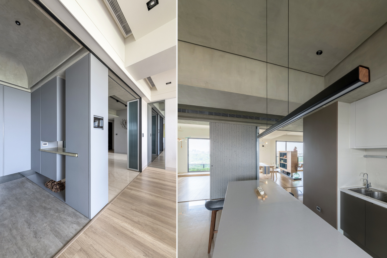
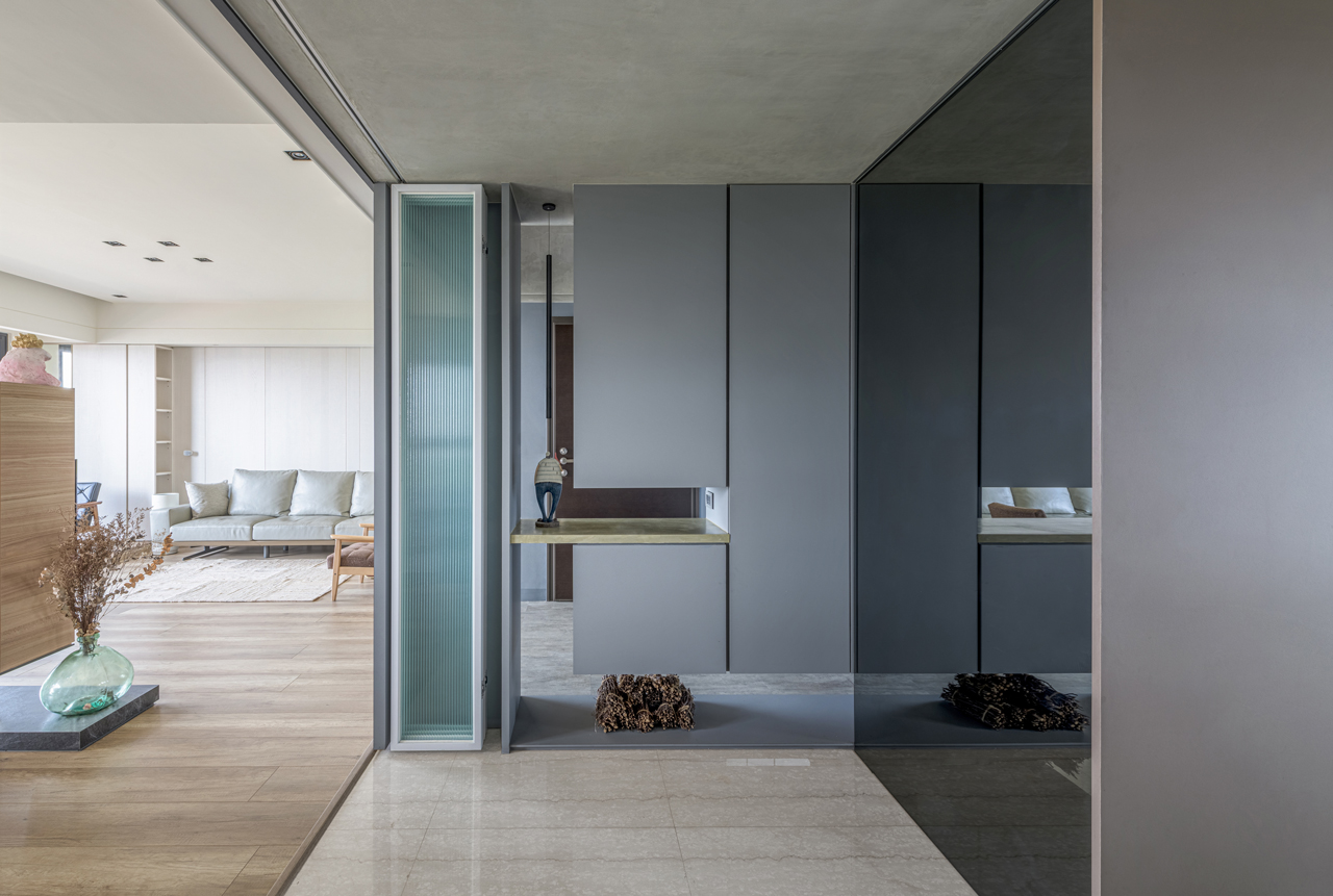
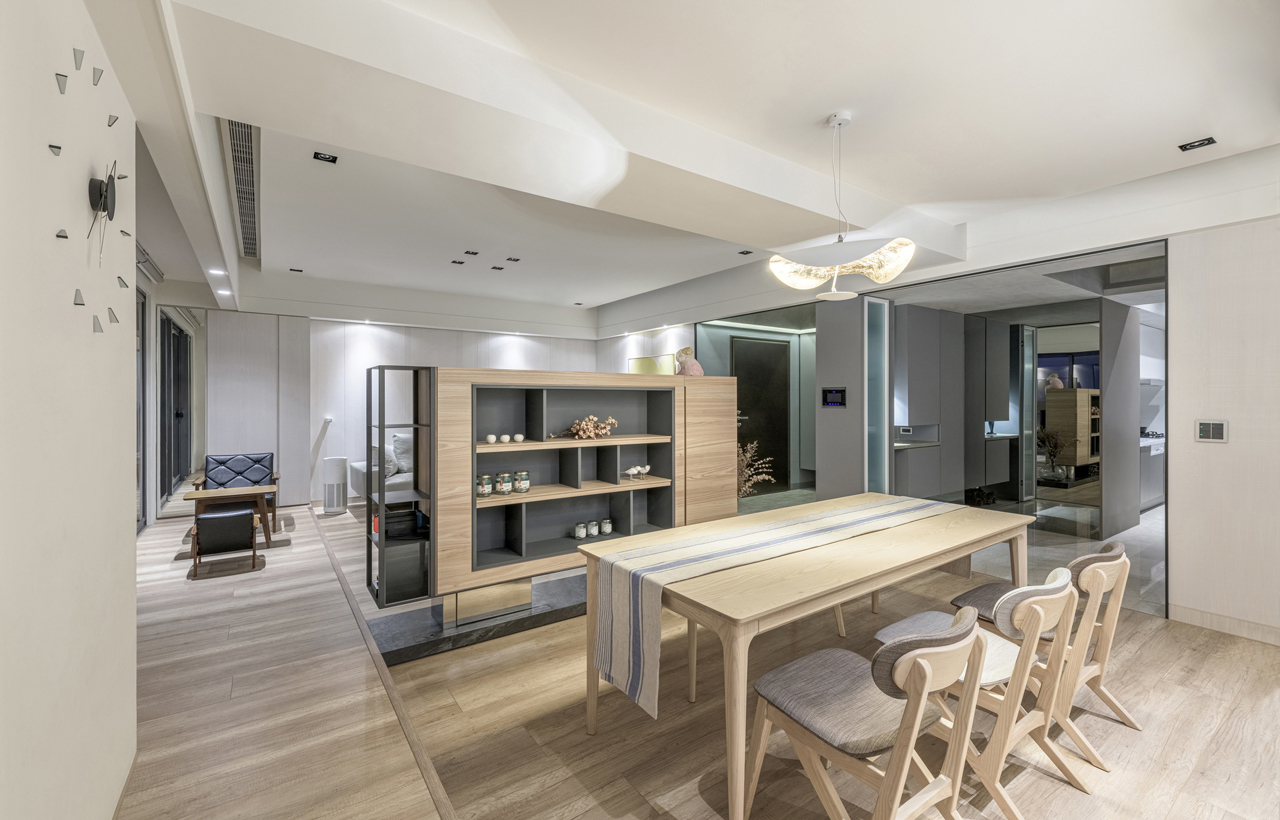
門廳以拱形天花結合懸浮櫃與展示牆面的設計,為界定內與外的場域引動出精巧的藝術質感,自玄關右側破口進入客廳,落地窗外衛武營的扶疏綠蔭近在咫尺,線性分割的客廳背牆削弱了低樓板高層建築帶來的高程壓迫,縮小量體的電視牆則最大程度降低客、餐廳之間的阻隔,讓公共區域在視覺與身體感知兩方面皆加大了尺度感。公共區域的另一側為廚房,T字形平面中藉由中島檯面的延伸,增加了四人座的輕食區塊,右側的木作展示牆巧妙地將推拉門收攏其中,可開可闔的設計為空間使用賦予不同的彈性,讓廚房除了平日下廚、用餐的空間,亦可作為三五好友來訪時品茗小酌、聚會娛樂的社交互動場域。
The unit entrance lobby features an arch-shape ceiling integrated with suspended cabinet and display walls, and defines a meticulous artistic quality to this transitional space. The interior procession starts on the right-hand side of the unit entrance before entering the living room endowed with the magnificent view of the lovely greenery vista of the Weiwuying National Kaohsiung Center for the Arts while the back wall of the living room relieves spatial compression of the low ceiling height high-rise building, and the minimized volume of the TV wall dramatically eradicates the spatial boundary between the living room and the dining room. It renders a spacious quality to the public spaces in visual and tactile perceptions. The kitchen, in a T-shape floor plan, is located on the other side of the public area, and features a four-seater space for casual dining extended from the island bench-top. The wooden display wall on the right-hand side creatively conceals the sliding door which imbues various degrees of usage flexibility for the kitchen as a cooking, casual dining area, and an interactive space on social occasions.
