Completion Year: 2014
Location: Kaohsiung
Completion Year: 2014
Location: Kaohsiung
古典美學再轉譯
Classical Aesthetics Retranslation
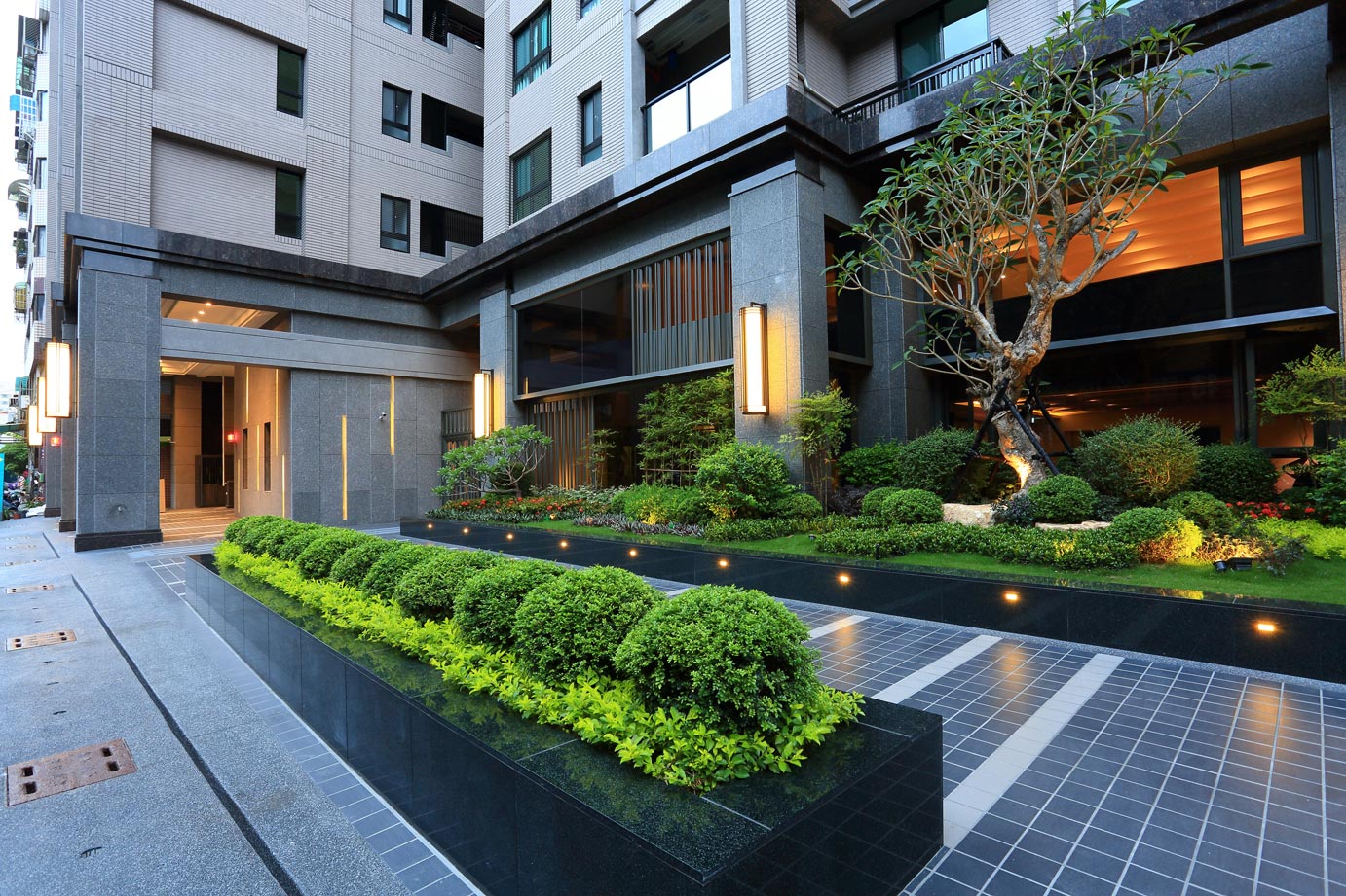
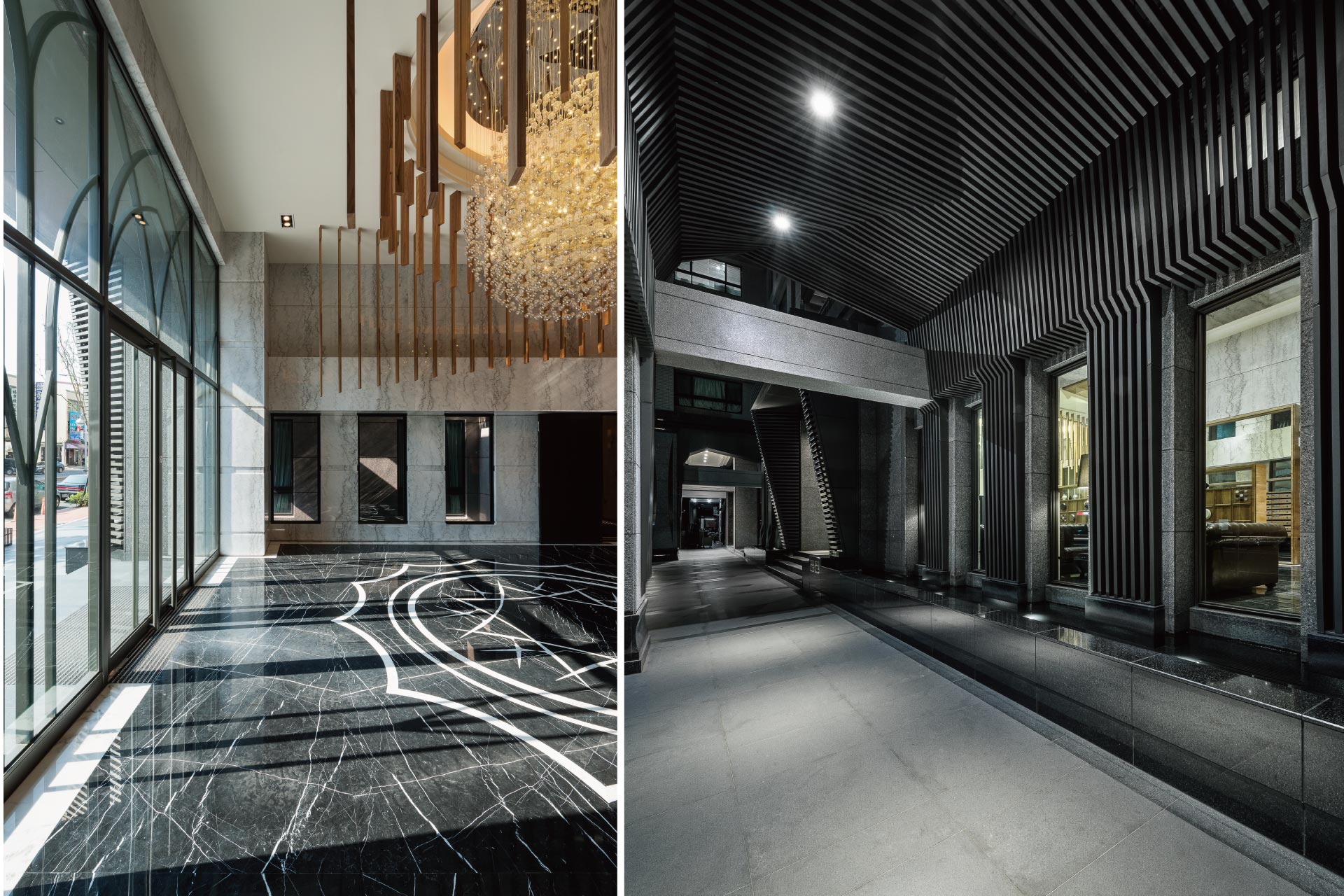
本案位於南台灣高雄某建設公司之建築公共空間,經過多方的討論,決議本案有兩個寫實的前提,第一是業主方希望設計上有古典的元素出現。第二是業主期望本案機能上除是一個住宅的公共空間外,希望導入博物館的氛圍。故我們在設計主軸上將創造一個生活與展示的交融場域,並嘗試在古典美學的基礎上重新再詮釋,放掉古典既有的包袱,用較寫意的方式,將古典建築抽象化、元素化或符號化,並透過當代的手法重新轉譯,巧妙地融入空間中,希望重新聯結現代簡潔與古典雅致的對話,簡潔有力的當代線條和語法中帶有樸實高雅的古典優雅。
The case is a public space of a construction corporation which located in Kaohsiung, southern Taiwan. After many discussion, there are two realistic premise of the case, first is the appearance of classical elements as the owner expected. The second is importing the atmosphere of museum to make the public area more than a building for living. Therefore our principal point of design is to create a blended ambience of life and demonstration. We attempted to re-interpret the space based on classical aesthetics. In order to achieve the goal, we replace the burden of classical pattern with more impressionistic approach to abstracting, element converting, symbolic it. Through the contemporary approach we re-translated the space with these ingredient, hoping to reconnect the dialogue between modern simplicity and the classical elegance. The design accomplished the humble and elegant classical style concealed in uncomplicated contemporary lines.
流動的空間格局
The spatial pattern of flow
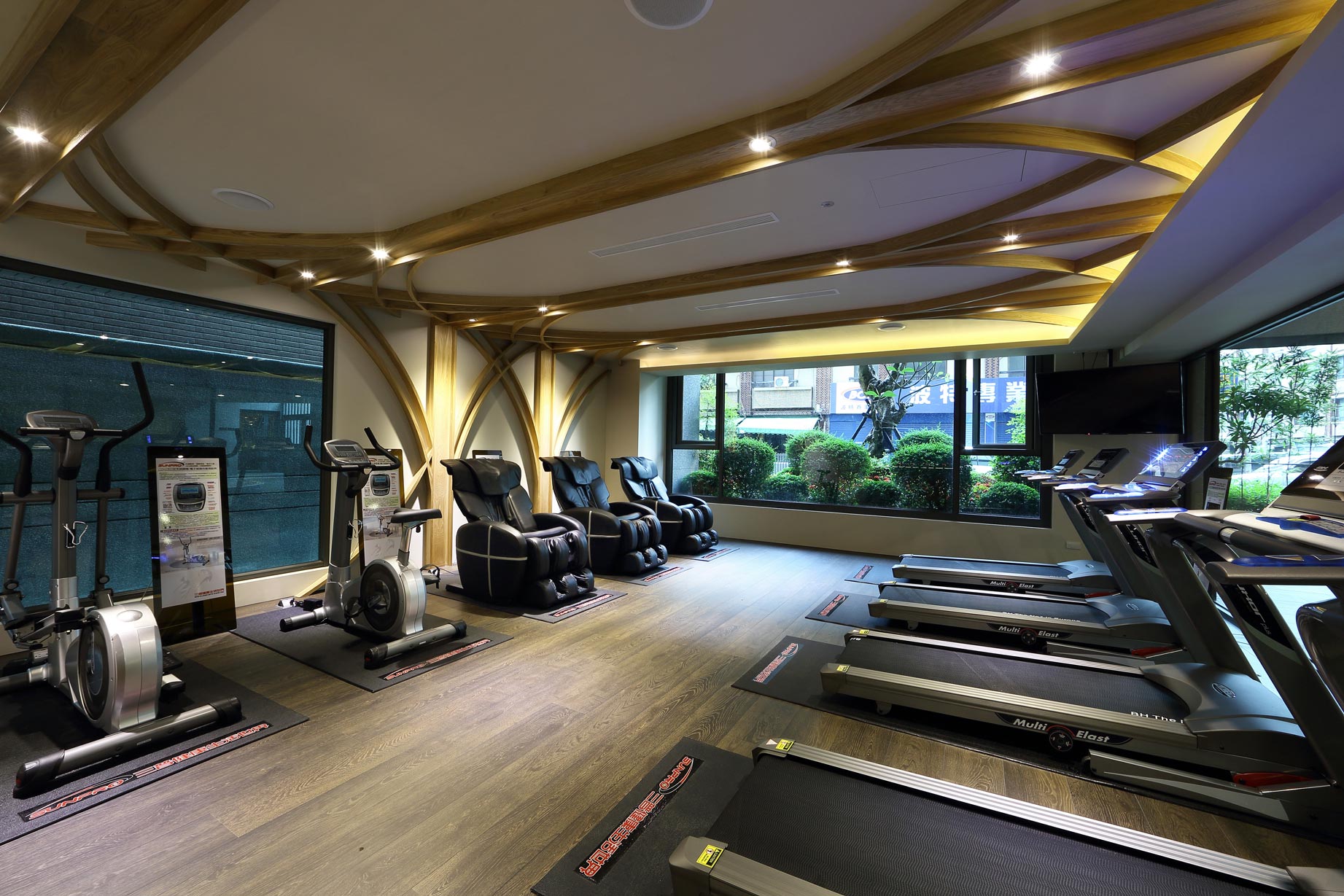
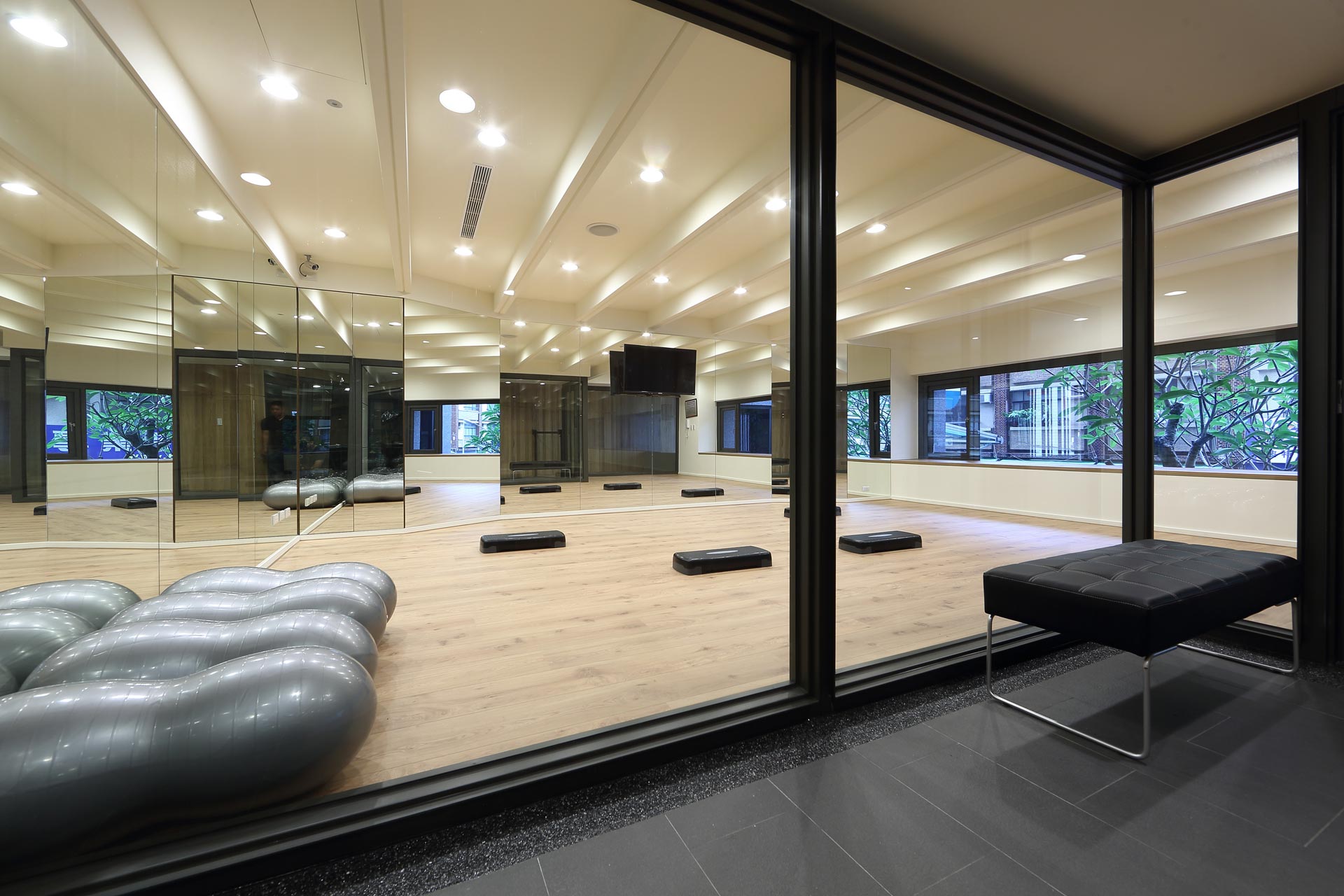
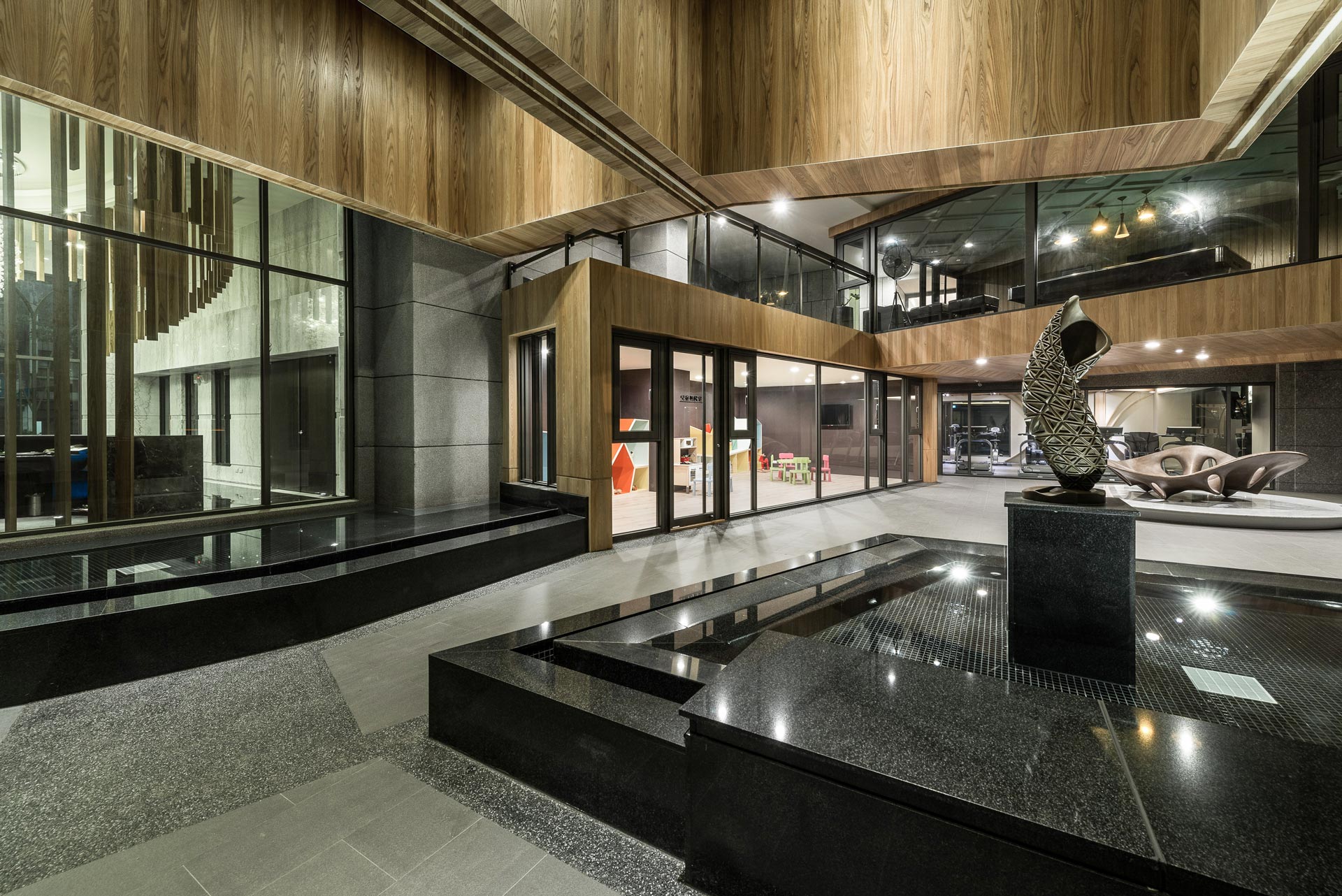
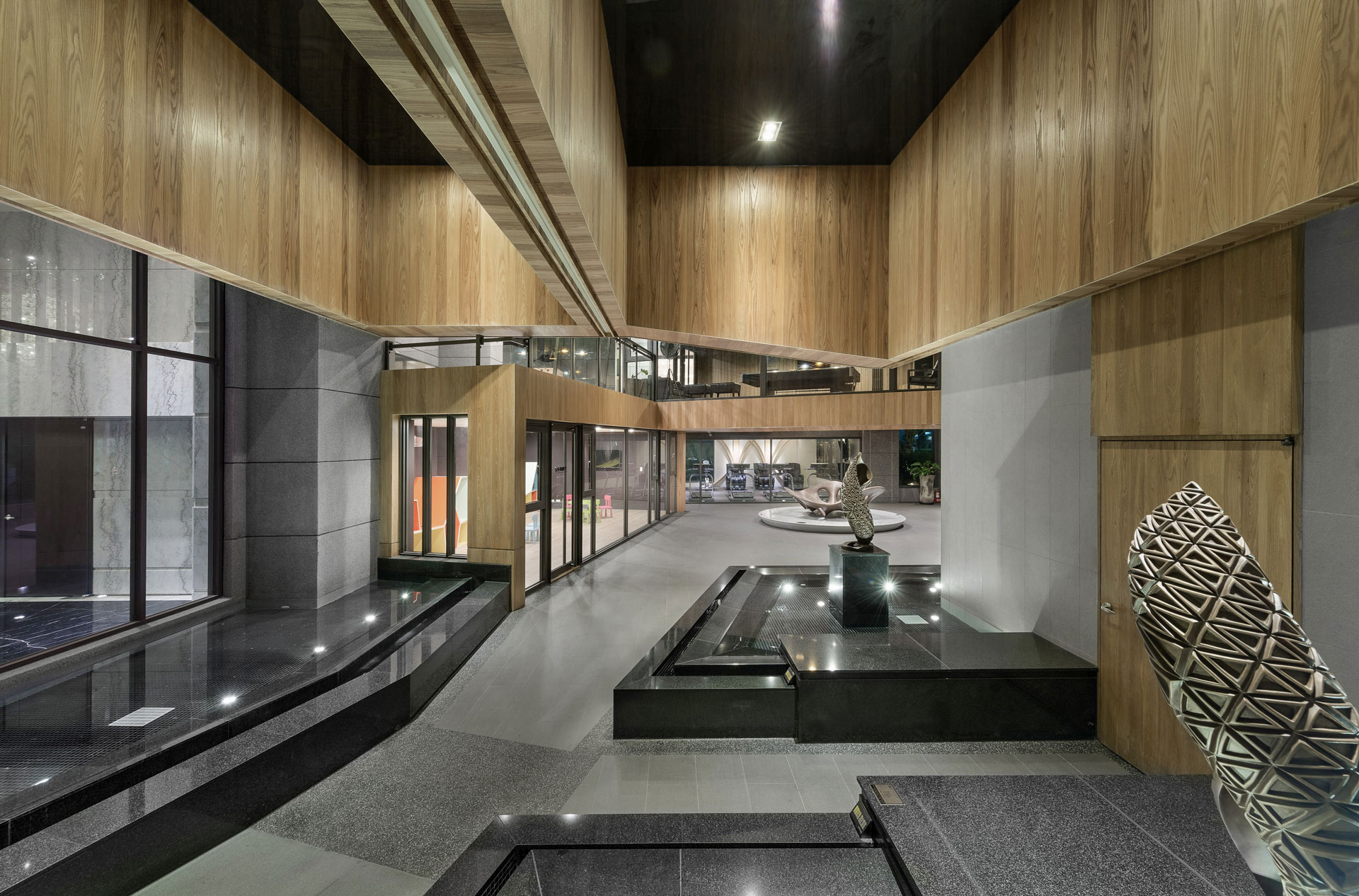
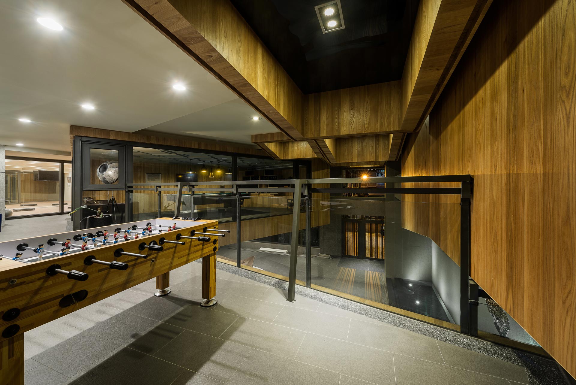
本案的公共空間很寬廣,在平面布局上和對於建築結構的處理態度上,我們有幾個開放式的做法。在平面配置上,基本上分為二大區塊:前廳和後廳,我們企圖打造一個流動的空間,故將隔間牆體全部拿掉,空間中找不到任何的隔間,並導入一條展示的動線,希望將建築的前後打開重新串連,並創造室內外關聯的最大可能。在後廳的部分我們也將建築外牆拿掉,讓最大量的光線與風能夠流竄進來,所以後廳基本上是一個半戶外的過渡空間,並且將每一種機能(如健身房、兒童遊戲間、交誼室等)放在一個個的盒子裡,懸挑的結構配合透過軸線的翻轉和盒子的錯疊,企圖創造出一個無落柱的半戶外開放場域。
Due to the public space is very wide and broad, we had a few approach for the concept of managing configuration plan and architecture structure. For the configuration, basically it divided into two area: Ante hall and Back Hall. We were seeking a method to create a flowing space, thus we removed all of the compartment walls, afterward the compartments is no longer been found in it. Moreover we insert an exhibiting path in this zone, opening the space of architecture in addition relinked the front and back yard, bring about the maximum possibility of producing the connection between indoor and outdoor spaces. In Back Hall, we tear down the facades, allowing the maximum amount of light and wind flows can spread in. Thence the Back hall is basically a semi-outdoor transitional space. We attempt to create a semi-outdoor opened field with no column by setting every function area (such as gym, playground for children, recreation room, etc.) in each box and combining the cantilevered structure, the rotation of axis and boxes staggered to attain the goal.
古典柱式再詮釋
Reinterpretation of classical column
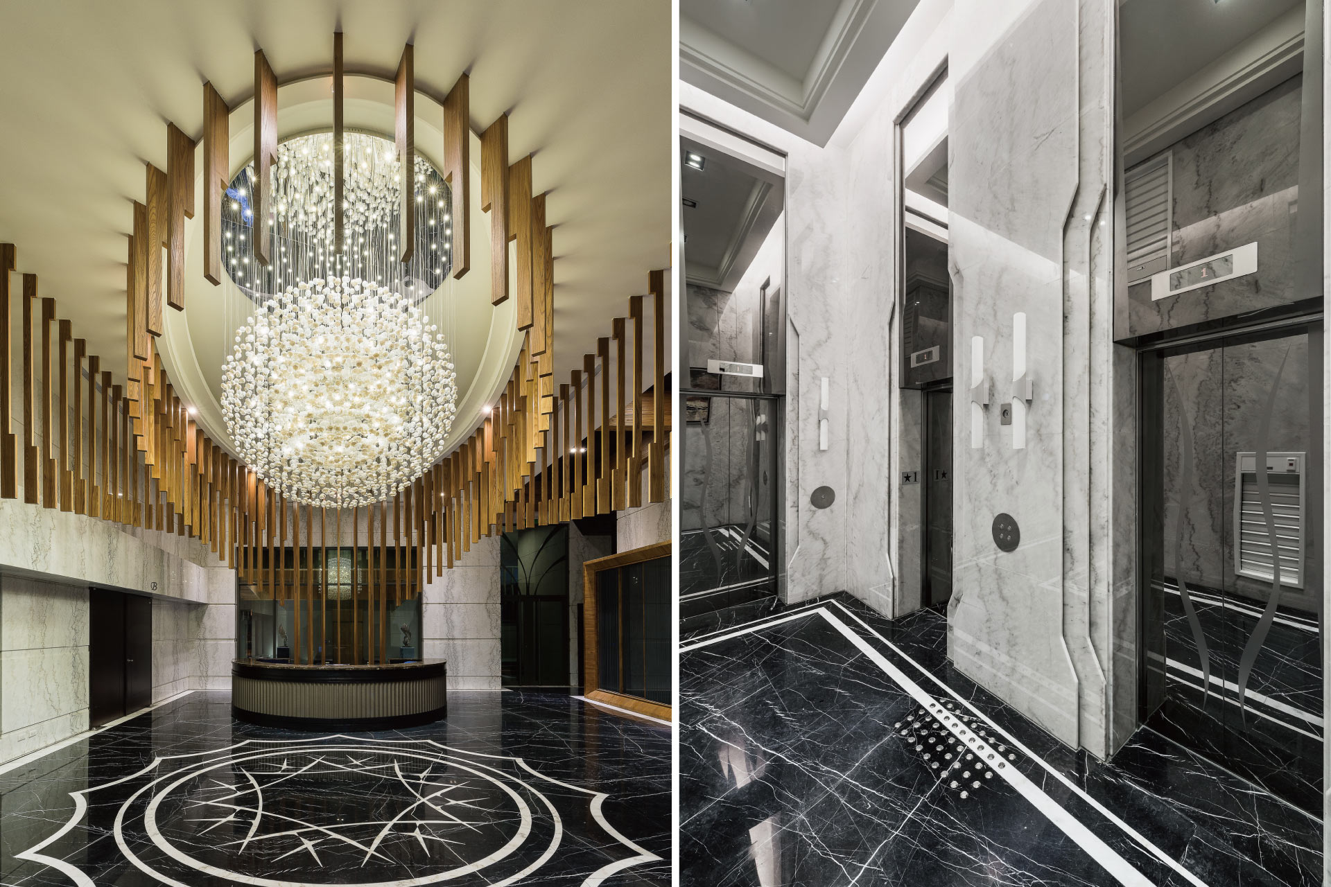
古典的元素優雅而細緻,我們導入當代美學的手法-「形變」(Morph),模糊並融接對於古典樣式中的頂、身、座等明確元素,透過形變的手法重新詮釋古典柱式。同時在幾個重點端景上,語彙上只保留其重要的弧形和曲線,透過幾條簡單線條重新勾勒,將三維的變化轉成二維的紋理(pattern),刻意營造出既古典又當代之空間經驗,創造出一種極富張力的和諧感。對於建築外廊的天花也是相同的手法,將壁柱(pilaster)與穹頂(dome),透過Morph的手法,重新勾勒保留其斷面線條,模糊融接的當代語彙中帶有古典雅致之感。
The element of Classical Aesthetics is elegant and delicate. We insert the technique of contemporary aesthetics - Morph, into blurred and merged classical pattern for the top, body, seat and other explicit elements to reinterpret classical column. On several light spot, we only left the significant arc and curve of it. By drawing a few pure lines, it turned a three-dimensional into two-dimensional pattern. We made an effort on creating a space experience of classical coexist with modern as well as a sense of harmony and tension. For the ceiling of corridor outside the building, we duplicated the same method. Through the skill of Morph, the pilasters and dome retain its cross-section lines but re-sketched. Making the blurred and merged modern pattern concealed the sense of classical elegance.
古典的數位藝術轉譯
Classical digital art translation
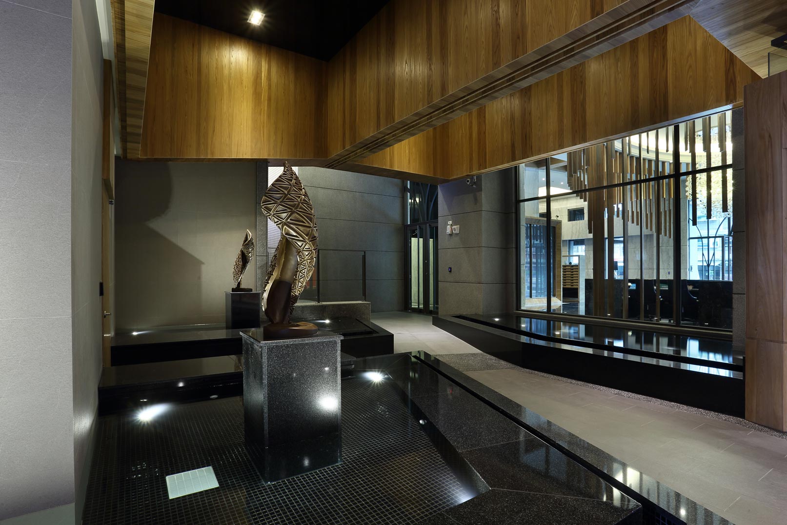
本案的藝術品都是特地為回應本案之量身訂做作品,在設計上遵循空間設計的脈絡,將古典的元素透過數位的手法轉譯。「風」系列作品希望捕捉自然能量的有機生命力,並運用當代參數運算模型,結合3D列印的新創作方法,以連續流動的幾何詮釋古典語彙的新生命與活力,創作過程中以輻射狀同心圓之點線面數學分割關係,不斷進行曲面實虛形變的數位擬態,層層蛻變為理性與感性交融的獨特有機容器。嘗試融合古典元素之質感氣韻,與當代數位衍生幾何的美學秩序,體現古典之新義。
The artwork for this case is tailored specifically. Following the spirit of interior design, we tried to convert the classical elements through digital skills. The series works called "Wind" appeal for capturing the organic vitality of natural energy. We used modern computing parameters combined with a new creative method of 3D printer, bringing out a new life and vigor for the classical pattern by a continuous flow of the geometrical interpretation. During the creation process, we took advantage of the point, line, and surface concepts of mathematical from concentric circles to make shapes dividing and reforming. After repeatedly digital simulations of curves revealed and concealed, the organic container turned out to be a unique combination of rational and sensibility. We trying to merge the qualities, and characteristics of classical elements, and the order of geometric aesthetics derived from contemporary digital, reflecting Classicism with a new implication.
