Completion Year: 2020
Location: Taipei
Completion Year: 2020
Location: Taipei
新商業模式-傳統門市到品牌概念館
New Commercial Model – Traditional Shop to Brand Concept Store
創立於1985的雄獅旅遊為在地旅遊產業的領先品牌,作為立足台灣,放眼全球的大型旅遊企業集團,近年雄獅除了在既有的旅遊產業深化推廣外,也開始導入資訊化與知識管理體系,透過以專業的泛旅遊生活服務延展,引領產業在科技時代持續前進。2020年受到新冠病毒疫情的衝擊,作為旅遊產業第一品牌的雄獅也改變其策略,由過去主打的對外商業輸出轉而成為對內的內容升級,強化品牌對於內容的創造力提昇。當代在數位思維的強勢介入下,在各方面都為人類生活帶來巨變,商業行為亦從過去傳統門店的設定中抽離,強化了概念體驗,因而有了嶄新的變化。本案基地位在台北市忠孝東路,為市中心精華區的品牌概念館,由過去零售店到現今的概念館,從地下二層到二樓,我們從整體建築、外觀立面到室內配置規劃進行一個系統性的設計梳理與定位,藉由空間敘事與體驗,結合企業本體的旅遊生活形式,以空間重構雄獅品牌在當代的定位。
The Taiwan-based Lion Travel, founded in 1985 has now become a local conglomerate of a leading brand in the travel industry with tentacles throughout the world in exerting its fervid promotional capacity in the travel industry. Furthermore, Lion Travel starts to introduce industry-leading information and knowledge management system as it extends a life-service model beyond the travel-related services. As impacted by the worldwide Coronavirus pandemic, Lion Travel shift its strategy from the external commercial output to the internal content upgrade in strengthening creativity. Nowadays, digital technology has brought changes to every aspect of people’s lives. It is a huge leap that commercial behaviors have evolved from the past store-front channel to an intensified concept-experience driven service. The site of this project is a brand flagship store situated in the premium retail precinct of Chunghsiao East Road with two levels above and below ground. The design team went through all aspects of systematic think-through of design in the overall building design, exterior elevation, interior layout, and brand positioning, which contributed instrumentally to re-structure the contemporary brand positioning of Lion Travel through the new spatial narratives and experiences.
體驗延展-旅遊品牌的T型設計
Extended Experiences – Type-T Design for A Travel Business Brand
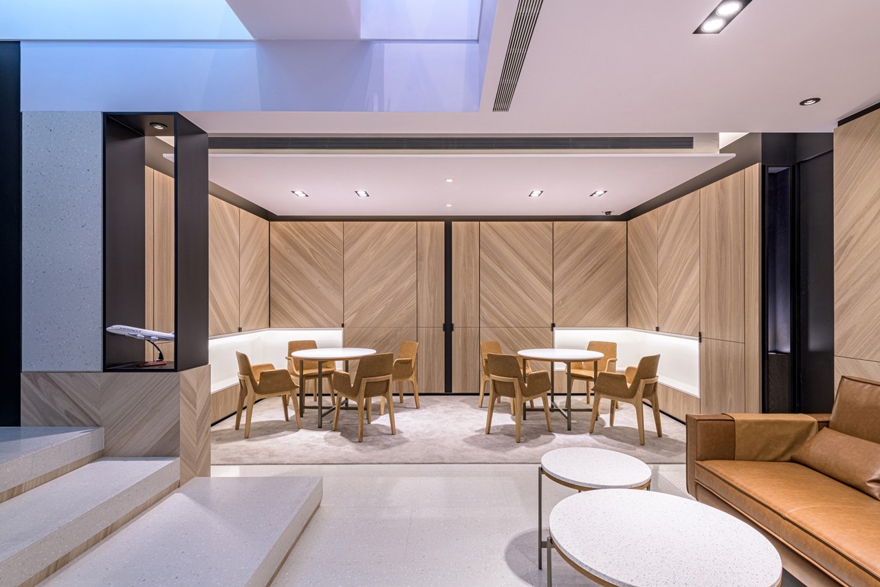
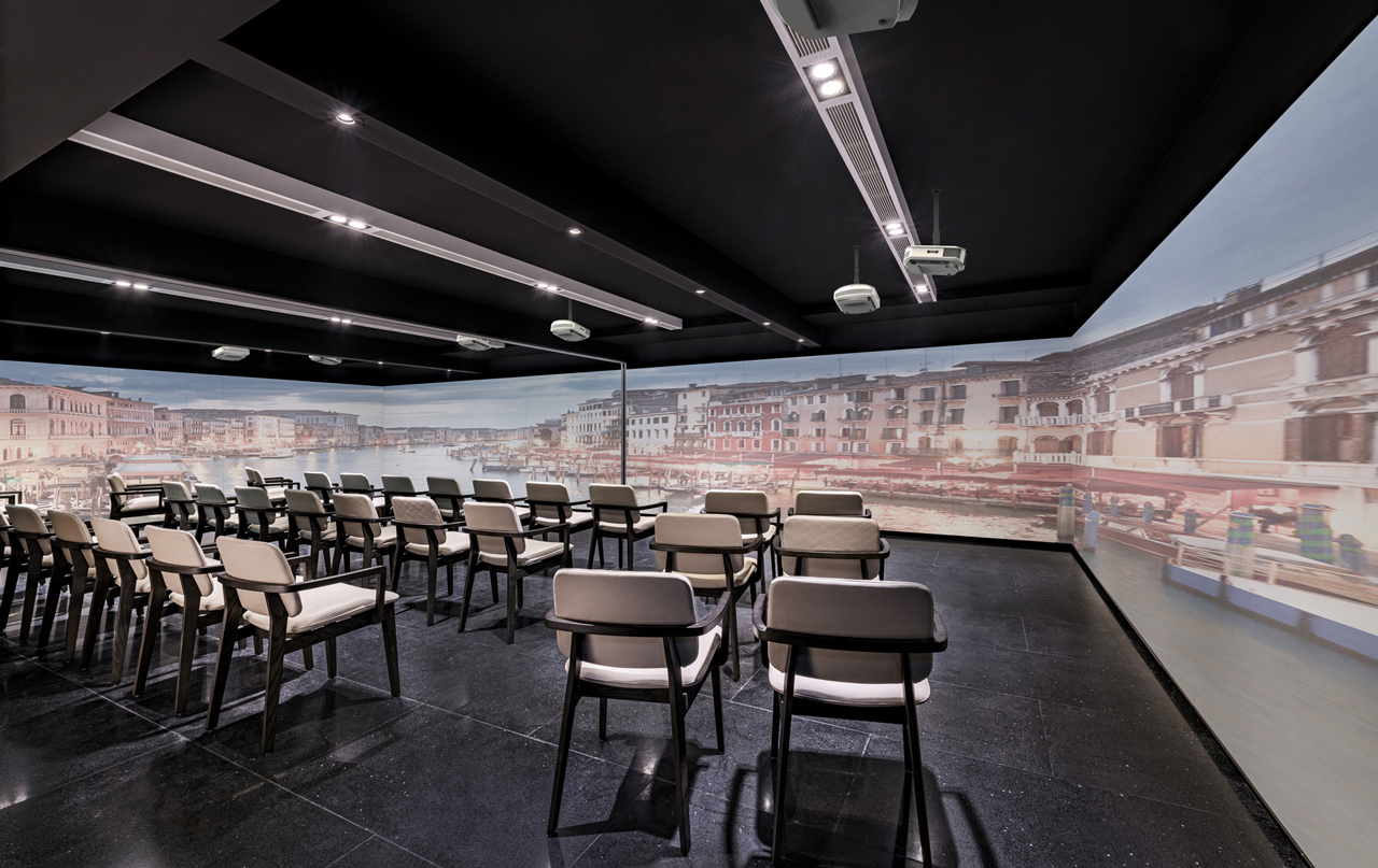
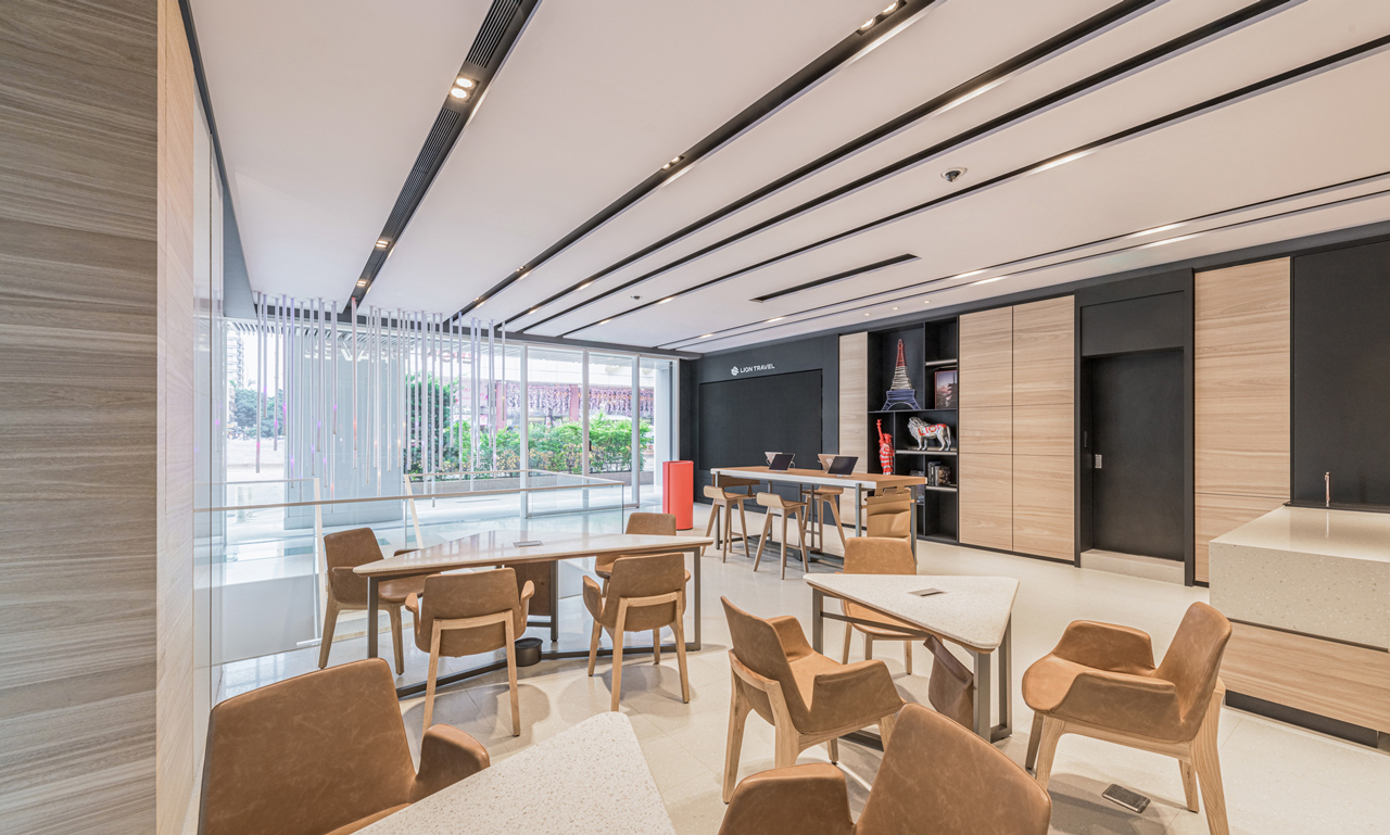
近年雄獅旅遊在經營既有的旅遊服務性產業之餘,亦開始加入與旅遊文化生活有關的其他項目,反映在概念店的空間設定上,我們重新定位室內不同空間的運用模式,以空間設計碰撞、對應企業的T型發展。概念店的各樓層皆有獨立的敘事主題-地下二樓「旅展廳」提供情境模擬的沉浸式體驗。地下一樓「旅會所」為VIP的專屬空間,一樓「旅驛站」則作為提供門市服務、諮詢洽談的區域,二樓「旅沙龍」則提供高質感的文化生活講座、說明會與工作坊辦理之用。除了多元的敘事空間建構外,概念店也植入兩種新機能-飲食(goonaEAT)與閱讀(gonnaREAD),飲食部分我們巧妙地透過設計將餐廳精神延續、轉譯,在有限的基地一樓後側,將停車空間打造為可承接飲食服務的區塊,未來透過城市移動攤車提供相關服務。閱讀部分則在一樓與地下室的角落設計可體驗質感旅遊生活的概念區域,形塑出旅行書房的概念場景,藉此整合當代旅者的使用需求,透過異質功能的介入強化旅遊生活的體驗感。
In recent years, Lion Travel has not only managed its existing travel service businesses but also entered into other businesses in travel-related culture and living domains, which has been reflected in the spatial design approach for the flagship store. The design team has redefined the usage models of various interior spaces to shape the interior to engage and echo with the Type-T corporate development. Each level of the flagship store is given an individual narrative. The B2 level offers an immersive simulation experience. The B1 level, “Travel Reception Area,” is the exclusive area for VIP customers. And, the ground level, “Travel Pit-Stop”, provides the space for retail and consulting services. The second-floor, “Travel Salon” caters for hosting high-quality cultural and lifestyle seminars, orientations, and workshops. Apart from the spatial construct of multiple narratives, the flagship store is also imbued with two new F&B functions such as goonaEAT and gonnaREAD. For food service part, our team cleverly extend and re-interpret spirits of restaurant through our design at the back-end section on the ground level. The parking spaces are created as F&B servicing area served by food trucks in the future. On the other hand, the reading program is designated on the ground floor and basement level corners offering experiences of quality travel life in the conceptual scenario of a traveling reading room, as it fulfills the needs of the contemporary travelers by the infusion of functional heterogeneity to intensify their traveling experiences.
設計整合-以資訊流與飛翔語彙串聯的未來體驗
Design Integration – The Futuristic Experiences culminated by the Flow of Information and flight terminology
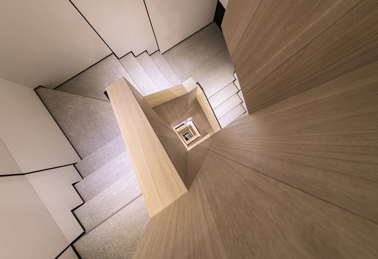
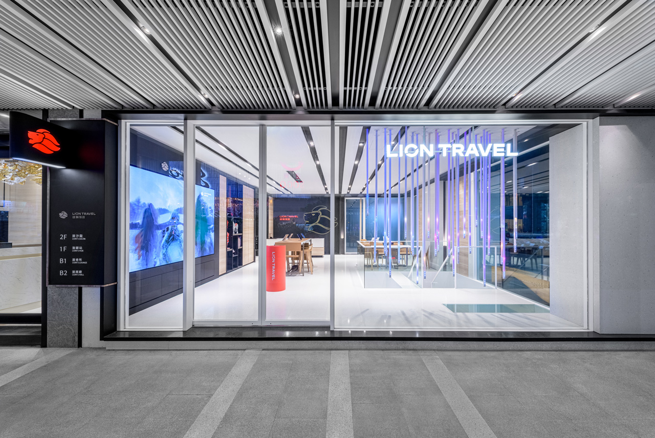
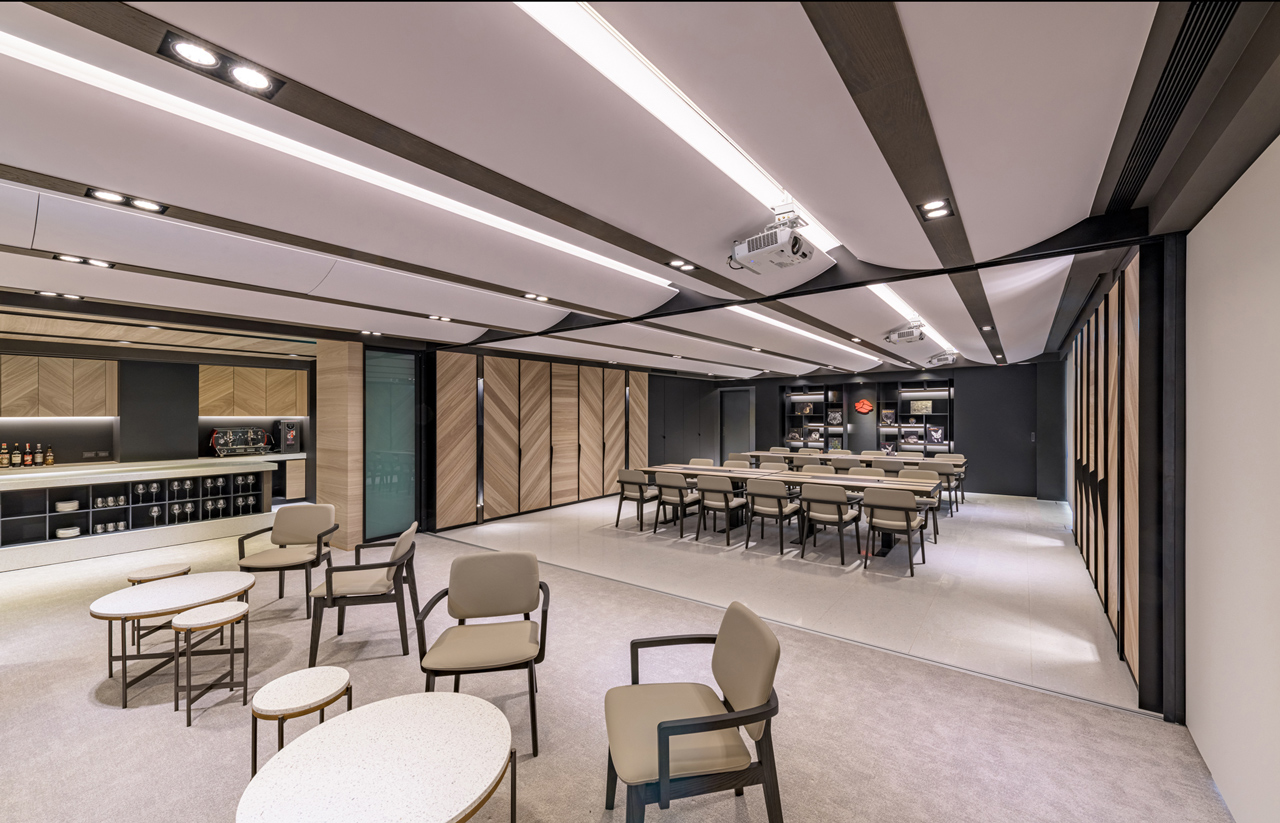
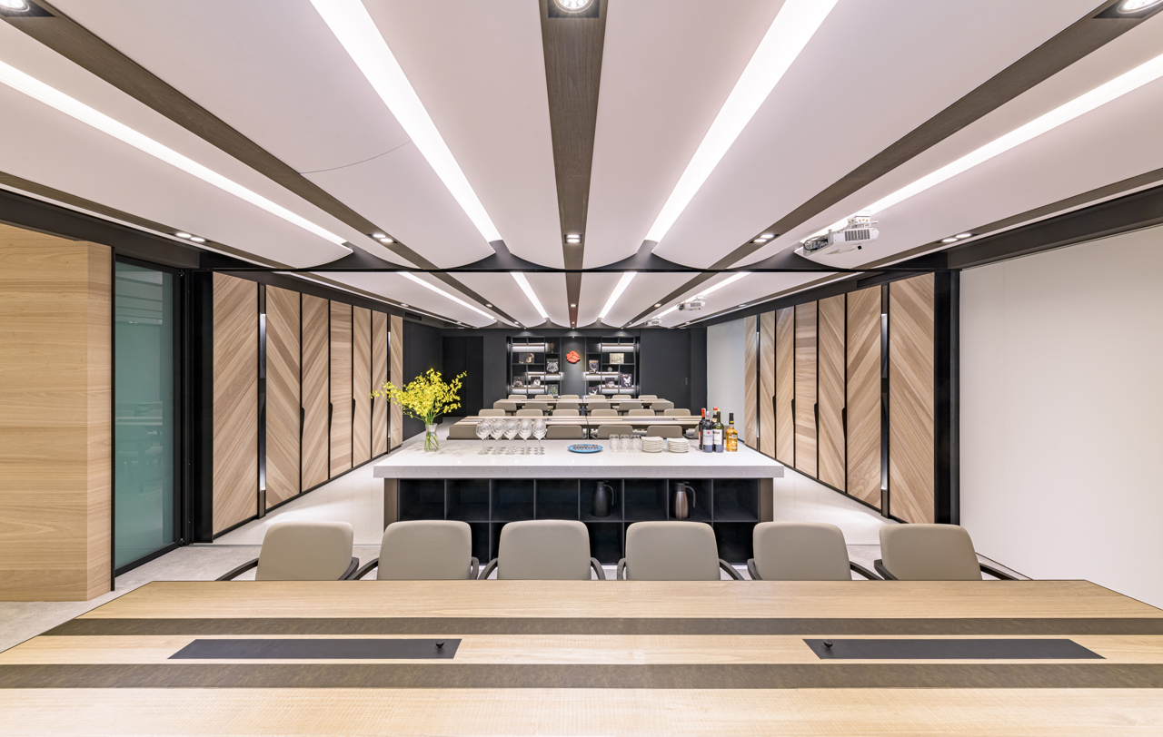
整體設計以「資訊流」概念發想,在建築外立面、騎樓及室內天花皆以白色金屬格柵包覆,垂直豎向切割的手法,從都市建築立面延展到半戶外的走廊區域,再轉入室內形成一個連續的整體,於外在形塑出獨特的速度感,一樓櫥窗立面導入訂製的時間裝置,以藝術的方式共構出全球城市時間。室內以白色調為基底,輔以木質材料混搭,在充滿未來氛圍與輕生活質感的空間中引入一絲溫暖、溫潤的情境,透過彈性的空間使用設定,創造出可以讓使用者自在地討論、洽談、上課的場所。此外,弧形的連續造型與細部設計,營造翱翔天際的旅行飛翔語彙,同時因應當代對於體驗感的需求,於B2的空間內導入AR、VR、MR等多種多媒體互動裝置,以數位媒材進行虛擬實境的旅遊情境模擬,拓展多樣化的旅行生活體驗。
The overall design creatively anchors on the concept of “Information Flow.” The exterior elevation, corridor and interior ceiling are all covered with white-color metal grilles in the array of vertical lines extending from exterior elevations to the semi-outdoor corridor area, before extending into the interior to form a continuous surface with a unique sense of dynamic speed. While the display window elevation on the ground floor features installation-art-like chronology devices simultaneously indicating the times of cities across the globe. The interior features white-color with its base tone complemented by traversing timber elements inundated with a sense of warmth in a futuristic and simple living to create a comfortable setting for users to discuss, consult, and host workshops through flexible spatial usage setting. Furthermore, the continuous arch-shaped forms and the detailed design articulate a series of flight-related terminology with the needs for experiential perception in imbuing AR, VR, and MR multimedia interactive devices to simulate traveling journeys through the mosaic of digital materials accentuating a diverse traveling experience.
