Completion Year: 2019
Location: Chengdu
Completion Year: 2019
Location: Chengdu
當代門窗-從少即是多到自由空間的流動性
Contemporary Doors and Windows – From Less is More to the Flowing Free Space
門窗,是構成建築的最基礎元素之一,位處空間內與外的中介區域,其出現可溯源至古羅馬時期,具有悠長的發展歷史。時至今日,伴隨時代進步與科技發展,門窗的應用也不僅侷限於傳統認知的出入孔道、通風、採光等功能性,而被賦予不同的時代與空間意義。反映在以門窗為主要銷售商品的製作展售公司,除了在線下展售空間完整介紹產品性能與特質外,如何藉由新形態的店鋪場景規劃,導入嶄新的銷售思維與體驗,同時將現代主義建築Less is more的極簡美學與功能取向理念,轉換到今日Free is more強調空間的自由度與流通性,成為我們設計思考的核心。
The door and window, one of the most fundamental elements of architecture, is the transition area between the exterior and the interior from ancient Roman time. At present, the applications of door and window are not only limited to address the functional needs of conventional access, ventilation, and natural lighting but also imbued with many milieu and spatial significance. Apart from comprehensively demonstrating product performance and features in the offline showroom, the design team needs to know how to introduce brand-new product sales mantra and experiences through a new form of store-front point of sales. While converting the minimalist aesthetics and functional approaches of the modern architecture movement of “Less is More,” to today’s “Free is More” in the emphasis of spatial freedom and fluidity, the design team has been reflected in the core value of a door and window manufacturing and sales company.
自由流動-建構豐富多元的社交場域
Freedom in Fluidity – Constructing an Enriched and Diverse Social Domain
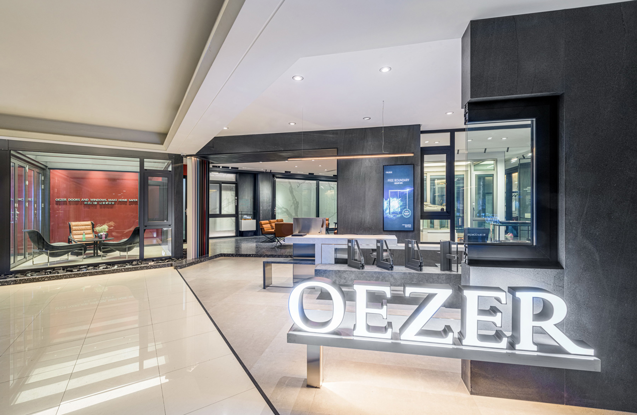
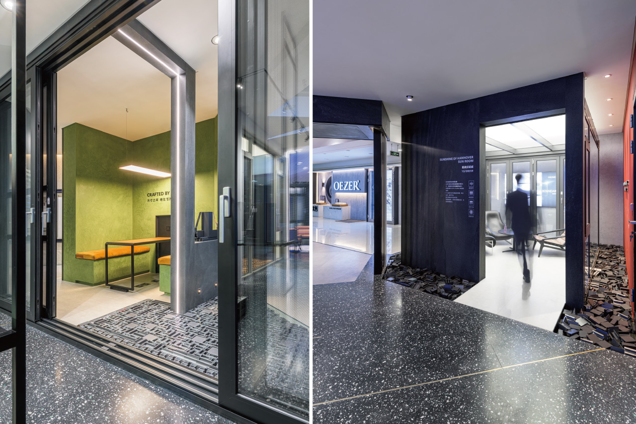
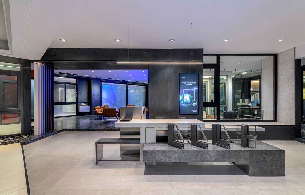
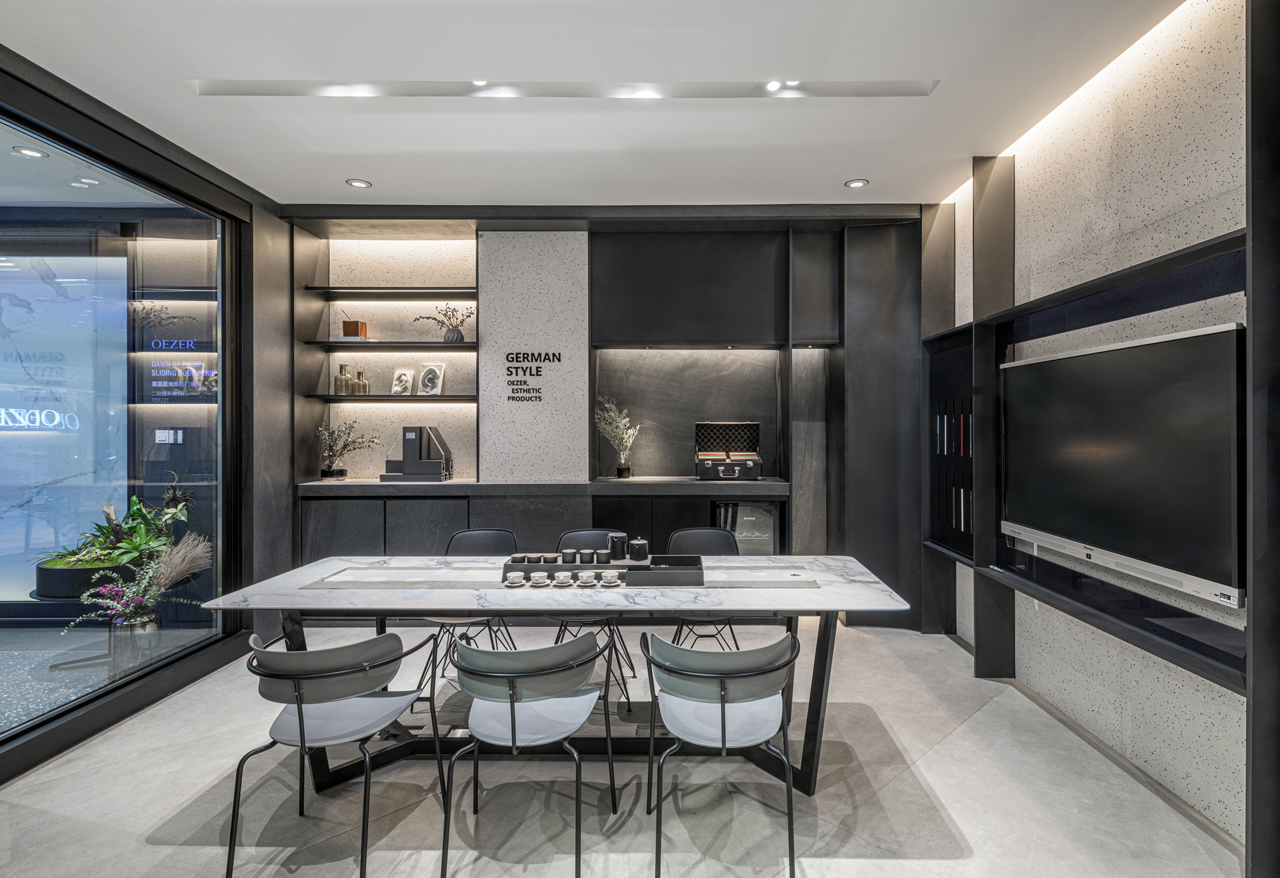
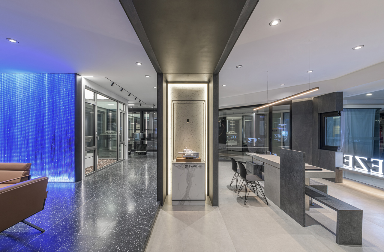
本次空間設計延續過去以當代簡約手法營造的品牌風格之餘,特別改善過去線下門店內部封閉的空間配置佈局,將室內轉為斜向軸線的分割,並釋放展區範圍的1/4空間,藉此強化與外界的互動性,創造多元的場域使用模式,建構自由度與流動性以回應Free is more追求自由空間的企業精神。順應斜向軸線的開放佈局,我們也將活動沙龍區置於整體區域核心,植栽造景及空間留白圍繞其中,未來可配合設計師交流、新產品發布展售等多重功能。規劃時考慮多組顧客同時洽談的需求,配置上增設多媒體互動與設計師系列產品展示空間,尋求硬件、產品與軟裝的製作提升,藉由異材質形塑的空間氛圍感受,賦予門窗在原始功能性使用之外,屬於空間情境上的不同意義。
In addition to sustaining the contemporary minimalist design style, the design of this project specifically seeks to improve upon the past offline stores- the closed-off spatial layout and composition by segmenting the interior with oblique-angled axes, and freeing up one-quarter of the showroom area to accentuate interaction with the exterior while generating a diverse domain usage model, which embodies freedom and fluidity to echo the corporate value of “Free is More” in the pursuit of free-flowing space. Given the open composition of oblique-angled axes, the design team has also designated the event-salon space as the centerpiece of the entire interior surrounded by plantation landscaping and spatial voids to cater for occasions such as designer-client consultation and new-product launch events, etc. When considering the need to facilitate multiple consultation discussions taking place simultaneously, we add the spatial layout to the showroom space for multimedia interaction and display of designer products with elevated production quality in hardware, merchandise, and decoration to imbue unique spatial significance in the doors and windows on top of its original functionality through spatial perceptions shaped by a mix of materials.
軸線翻轉-創造空間中的不確定性
The Influx of Axes – In Creating the Spatial Uncertainty
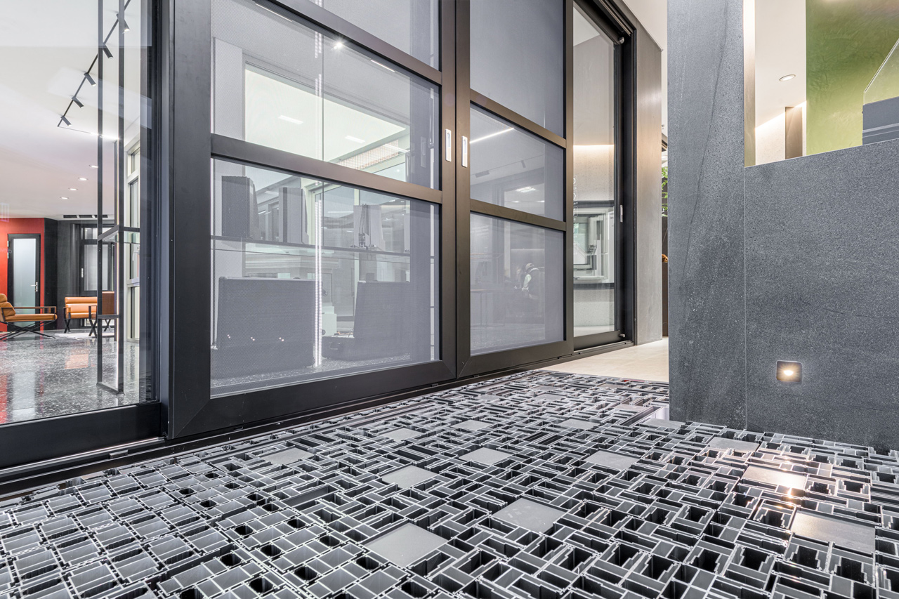
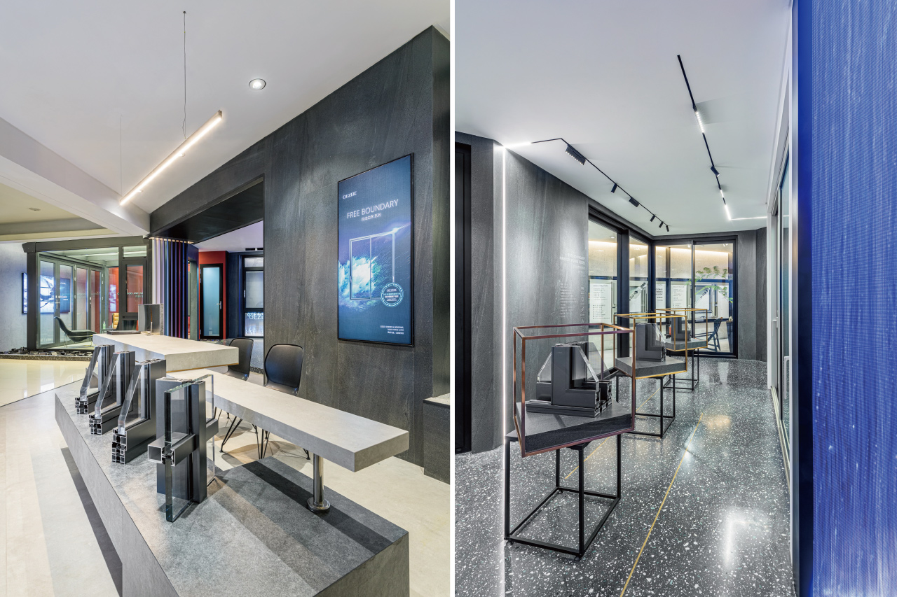
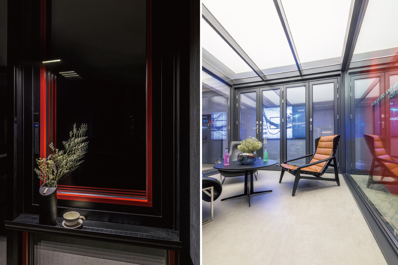
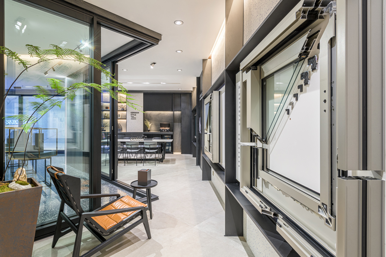
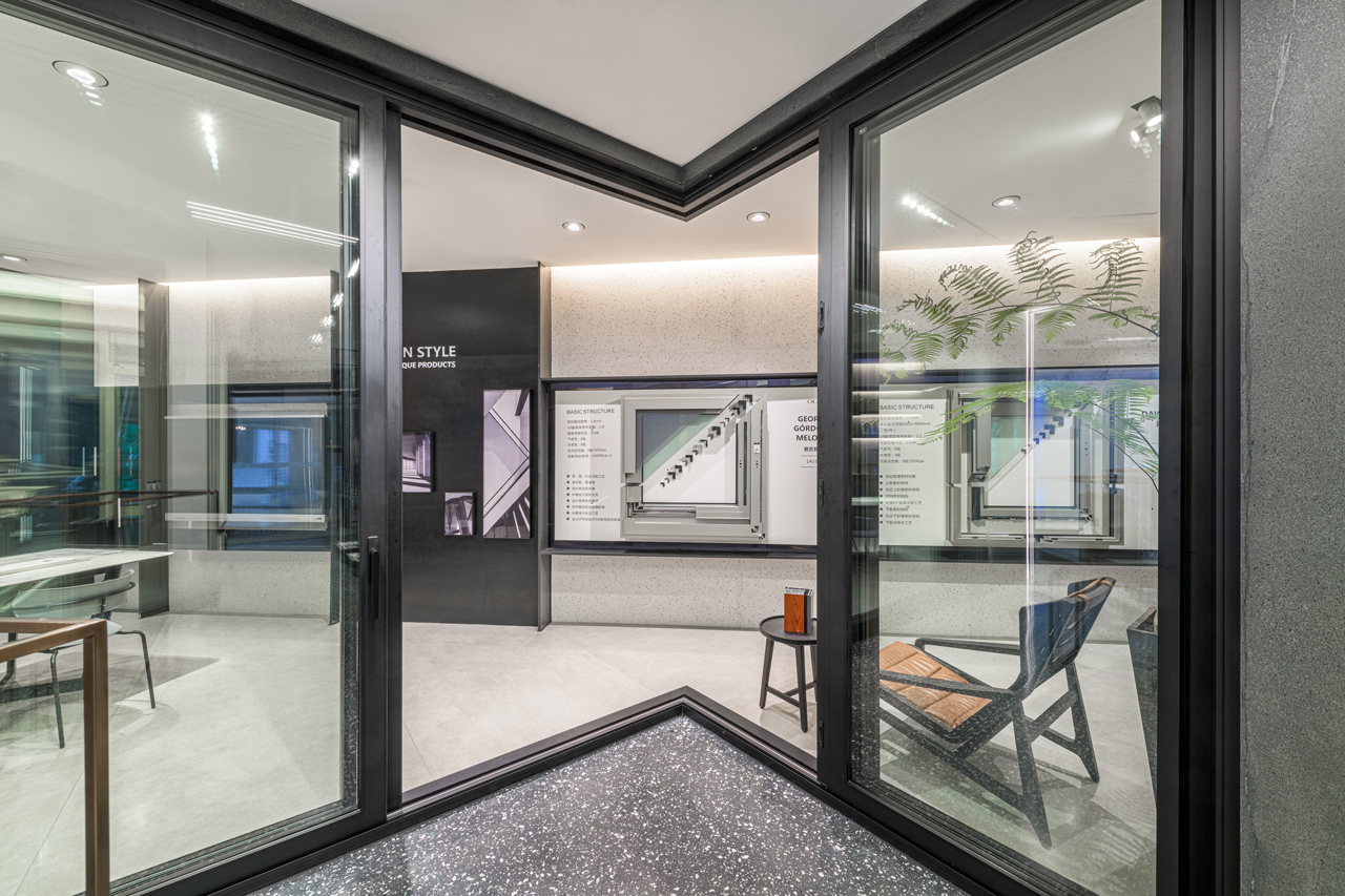
呈現矩形的基地範圍中,延續線下店以黑、白、灰三原色為主調結合水磨石、金屬板與天然石材的精準混搭,打造品牌特有的當代質感。空間配置規劃上,團隊以內退的斜向軸線與虛化的模糊邊界。同時,格局軸線的翻轉則打破既有平面框架,除了能建立清楚的空間主從關系外,也創造出許多驚喜的空間角落,在強化空間穿透感的同時亦增加空間中人與人的互動。此外,也將現有門窗產品融入牆面設計中,以打破傳統展示隔間對門窗尺寸的寬度限制,透過模糊邊界、融入展品與留白場域等不同空間設計手法,創造屬於品牌商業空間特有的差異性。
Within the rectangular site area, the design continues with the precise combinations of tri-color-tones of black, white, and grey complemented by terrazzo, metal plates, and natural stone materials in exuding the contemporary look and feel unique to the brand. In terms of the planning of the spatial composition, the design team blurs the boundary by recessing oblique-angled axes. At the same time, the over-turning of the axes has not only broken through the existing floor plan but also established a clear spatial hierarchy while creating many surprising spatial alcoves for optimizing interpersonal interactions as well as accentuating the effect of spatial penetration. Furthermore, by blending the existing door and window products into the wall design, the design team breaks down the limitation on the door and window dimension posed by the conventional display partitions. Through blurred boundaries, the infusion of the display objects and spatial voids, etc., a unique spatial differentiation is created with a brand-signature stroke of ingenuity.
