Completion Year: 2020
Location: Shenzhen
Completion Year: 2020
Location: Shenzhen
當代門窗-從少即是多到自由空間的流動性
Contemporary windows and doors: The thinking from “Less is more” to “Free is more”
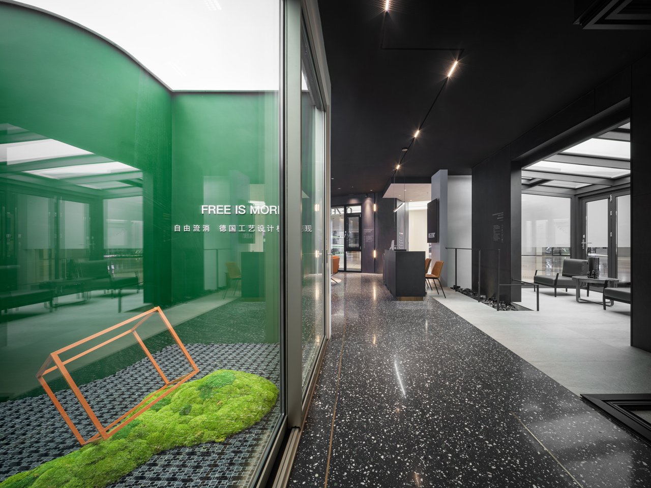
門窗,是建築的最基礎構件,位處空間內與外的中介區域,其出現可溯源至古羅馬時期,具有悠長的發展歷史。時至今日,伴隨時代進步與科技發展,門窗的應用也不僅侷限於傳統認知的出入孔道、通風、採光等功能性,而被賦予不同的時代與空間意義。反映在以門窗為主要銷售商品的門窗製作展售公司,除了在線下展售空間完整介紹產品性能與特質外,如何藉由新形態的店鋪場景規劃導入嶄新消售思維與體驗,同時將現代主義建築Less is more的極簡美學與功能取向理念,轉換到今日Free is more強調空間的自由度與流通性,成為我們設計思考的核心。團隊調整品牌初始以極簡爲表象的簡約風格,轉向自由平面及軸向轉移的手法,使室內出現更多不可預期性,進而表達Free is more的空間形態。
Windows and doors are the fundamental elements of architecture, which act as intermediaries between interior and exterior spaces. Windows and doors can trace their development back to the ancient Roman period with a long history. Nowadays, with the advance of science and technology, the application of windows and doors is no longer limited to the traditional functions of access, ventilation, and lighting, and endowed with meanings in time and spatial. In this retail, the feature introduction is undoubtedly essential. Additionally, the modern thinking and experience delivered throughout next-gen stores became the core concern, to transform the modernism architecture concept “Less is more” that focused on minimalist and functionalities. The contemporary spirit “Free is more” emphasizes freedom and transparency of space. In this project, the design team continued with the brand’s minimalist style, implemented the free planning and axial shifting to set aside undefined spaces, ended up with a spatial true to “Free is more”.
鑑往知來-從過往經驗中探尋未來可能
Macroscopic vision: Exploring the future on a solid foundation
本案是團隊在品牌系統化思維(5I系統)下的實體店鋪設計實踐,這樣的系統化思維是四年來與品牌長期合作下發展而來。設計上在延續過去以當代簡約手法營造的品牌風格之餘,特別改善過去線下店鋪內部封閉的空間配置佈局,強化與外界的互動性,創造多元的場域使用模式,建構自由度與流動性以回應Free is more追求自由空間的企業精神。此外在場景與軟裝規劃上,藉由增設多媒體互動與設計師系列產品展示區,尋求硬件、產品與軟裝的製作提升,並將過去與品牌共同合作策展、展會、課程分享、產品設計等經歷的文化元素運用其中,讓它們成為擺設的一部份,藉此回應品牌從過去的基礎上探索未來的企圖。
This retail store was a physical practice under the systematic branding theory (5I system), the resulting from four-year cooperation between enterprise and design team. The design improved the enclosed layout while further extended the brand's style of contemporary simplicity. Such planning successfully strengthened the interactive to exterior space and created various possibilities, thus deepening the freedom of usage and response to the enterprise spirit. Meanwhile, on the planning of interior design and decorations, a multi-media interaction area and designer product showroom were set to enhance the image of products and optional equipment. Cultural elements including their past exhibitions, workshops, and design solutions also been a part of interior decoration, echoed the brand’s vision to explore the future based on a solid fundament.
空間設計-差異性建構的品牌空間自明性
Space design: The brand spaces' self-explanatory constructed with differentiations
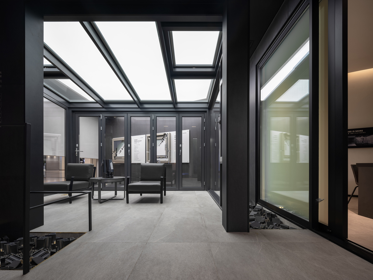
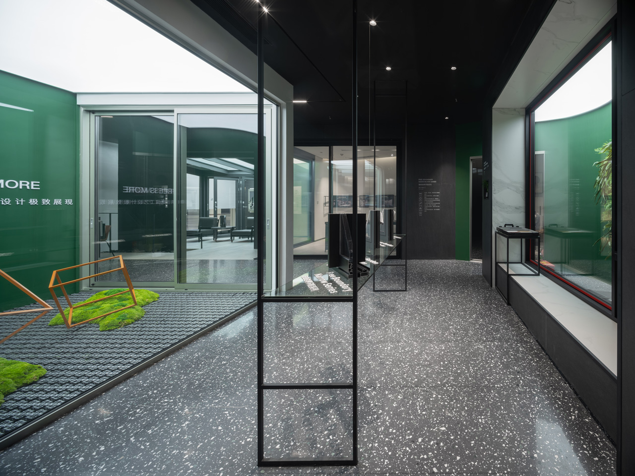
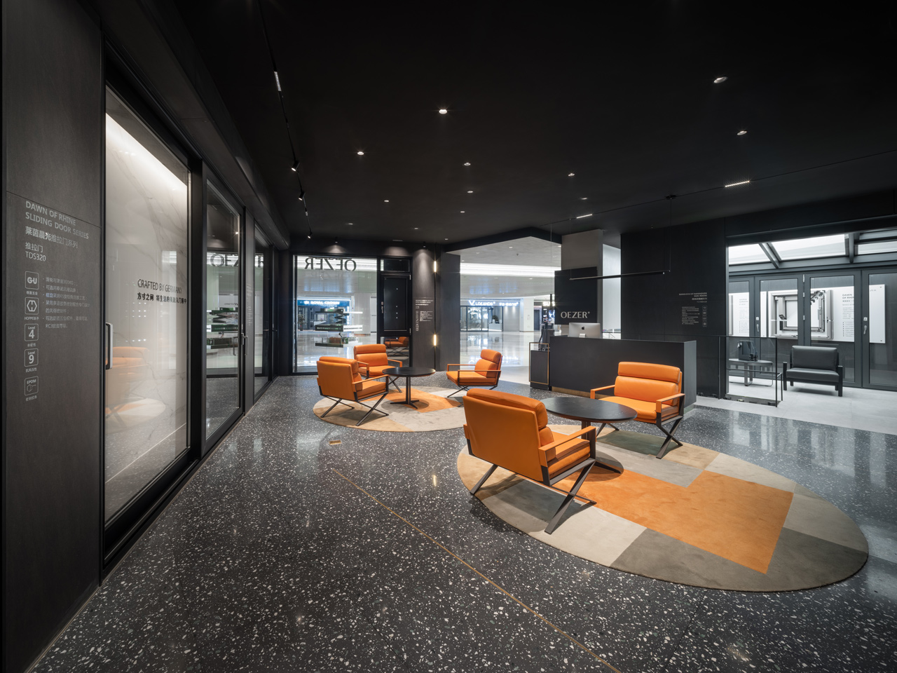
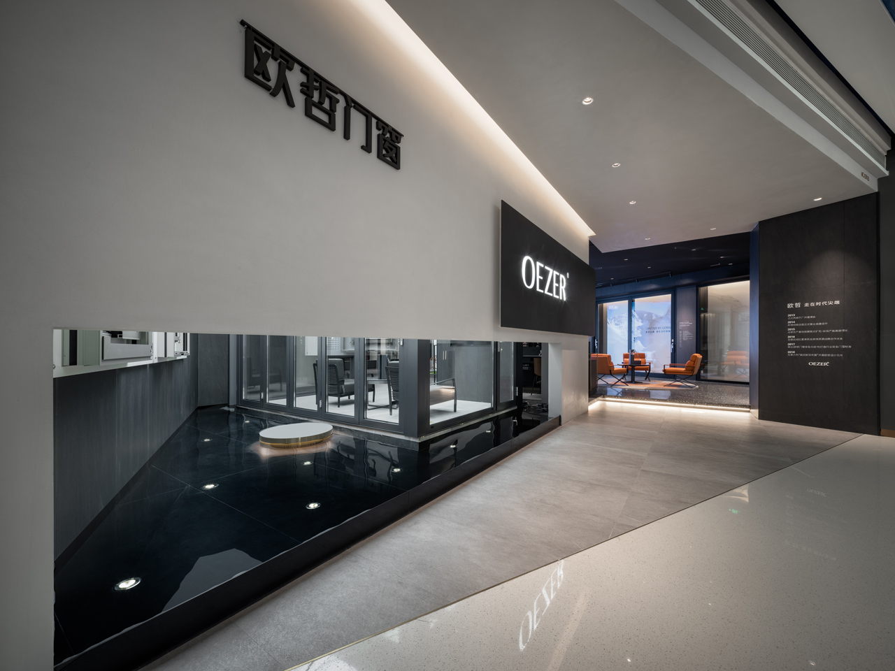
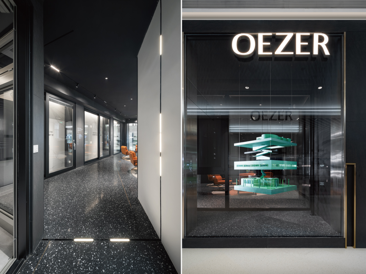
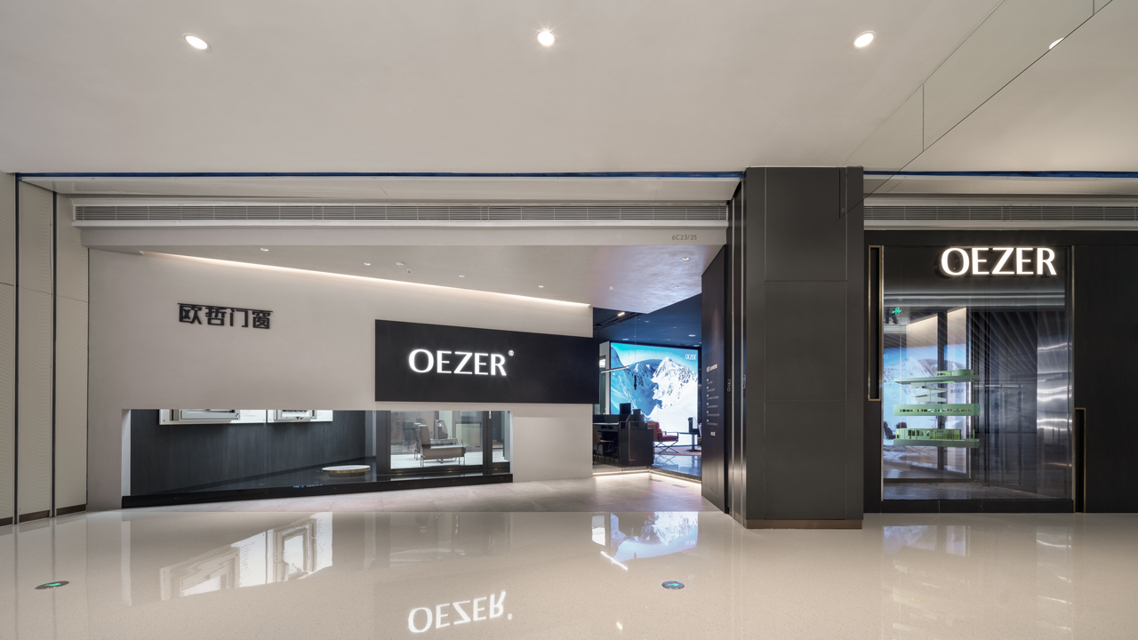
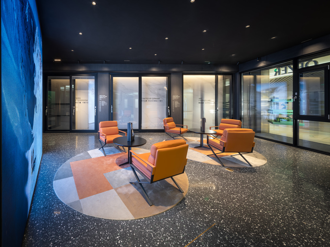
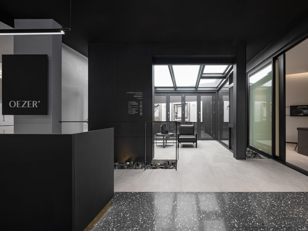
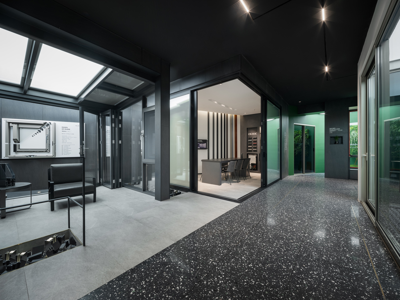
矩形基地範圍內,延續線下店以黑白灰三原色為主調結合水磨石、金屬板與天然石材的精準混搭,打造品牌特有的當代質感。空間配置規劃上則以內退的斜向軸線與虛化的模糊邊界,打破既有格局框架,並創造明確的使用分區,在強化空間穿透感的同時亦增加人與人互動的機會。此外,團隊還特別將現有門窗產品融入牆面設計,以打破傳統展示隔間對門窗尺寸的寬度限制,並順應斜向空間的開放佈局將活動沙龍區置於整體區域核心,植栽造景及空間留白圍繞其中,未來可配合設計師交流、新產品發布展售等多重功能,進而打造品牌不只是傳統建材販售,更在乎參訪者能在此透過學習、交流產生互動。在團隊以模糊邊界、融入展品與留白場域等不同設計手法,結合開放式的空間規劃下,一個著重交流、分享的實體店鋪被賦予不同意義,並創造屬於品牌商業空間特有的差異性。
Within the rectangular building lot, the tricolors' tone of black, white, and gray integrated with terrazzo, metal plates, and stones to build their unique yet contemporary characteristic. The overall space was designed with a retreated tilted layout and fuzzy boundaries, breaking the existing framework, creating clear zoning, and strengthening the sense of transparency while increasing interactive opportunities. Finally, designers incorporated those window and door products into walls, spun the width limitation of the traditional showroom. The salon area complied with the tilted layout at the central position, surrounded by planting and blank spaces for events including gatherings and exhibitions. Such design thinking made space far beyond business mere function but look for the learning and communication among visitors. With those insights and open space planning, a retail store emphasizing interacting and sharing was born to promote the brand’s commercial spaces’ unique differentiation.
