Completion Year: 2017
Location: Nanchang
Completion Year: 2017
Location: Nanchang
多元衍譯-以質感生活共構的新型展售場域
Multiple translation- a new type of retail store con-constructing by qualitative living
自工業時代之始,特定商品的展示銷售,便以講求效率、精準、實用的模式進行,面對科技極速進步及資訊扁平化的當代,傳統磁磚店以單一類別、靜態呈現,缺乏彈性的1.0銷售模式,即面臨嚴峻的挑戰。究竟在當代,我們如何透過新思維重新思考實體零售店?藉由互動式多媒體(HCI)、文化生活的置入與異業結合的方式,以空間的設計操作,將引動實體零售商業行為進化至2.0模式化為可能?也是我們對於本案位處大陸南昌磁磚展售空間的嘗試。
Since the beginning of the industrial age, displaying and sales of particular products focus on efficiency, precision, practical mode. Facing the contemporary of rapid technological progress and information delayering, traditional tiles shops with a single category, static presentation and lacking of elasticity 1.0 sales mode are facing severe challenges. Exactly in present, how we rethink physical retail stores through new thinking? Operating design the space by HCI, placing of cultural life and the combination of different ways, will possibly drive the entity retail business behavior to evolve to 2.0 model? This is our attempt to the tile sales space located in Mainland Nanchang.
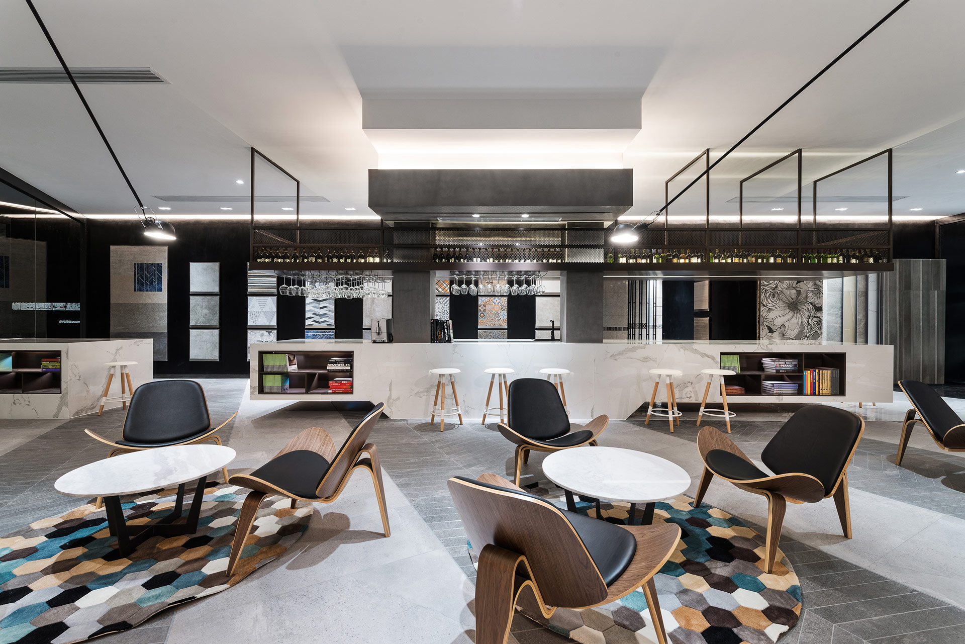
自由平面-瓦解邊界建構文化生活體驗空間
Free plan- Disintegrating the boundary and constructing cultural life experience space
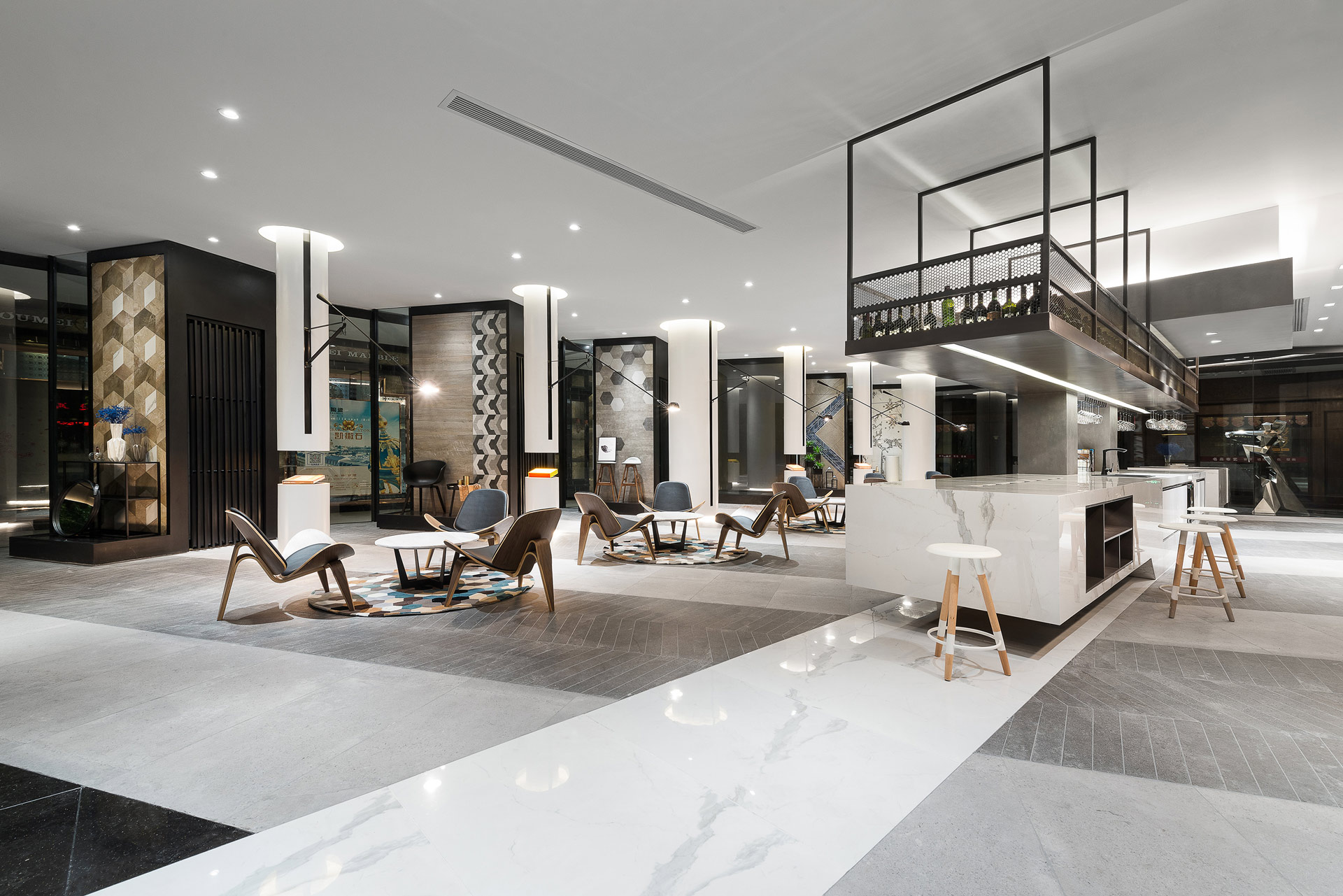
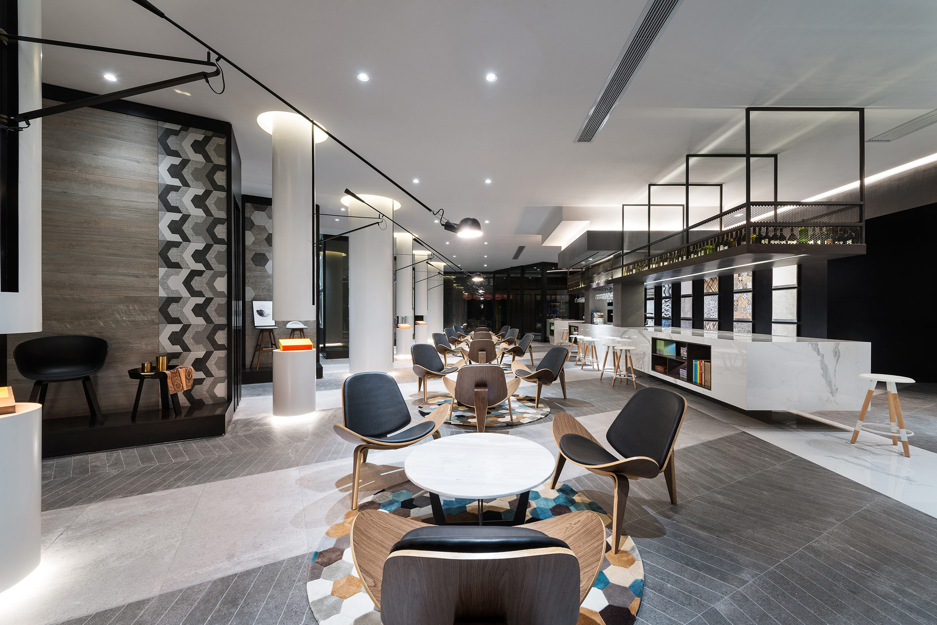
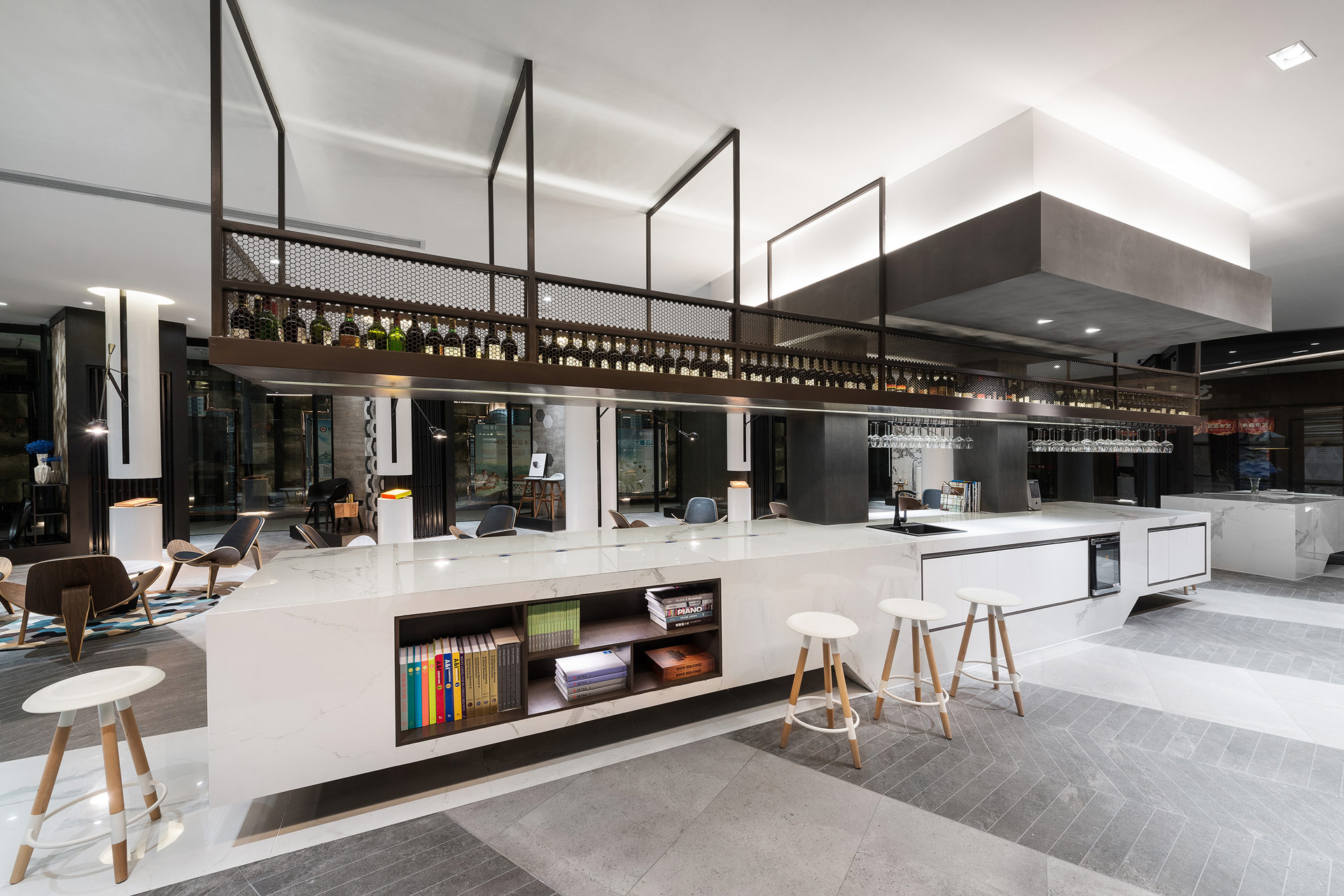
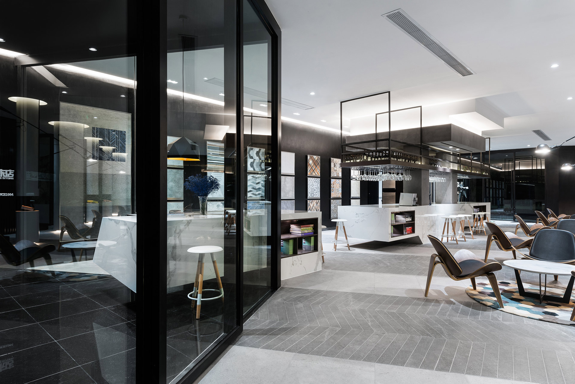
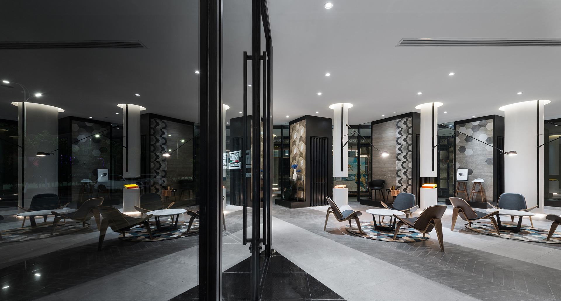
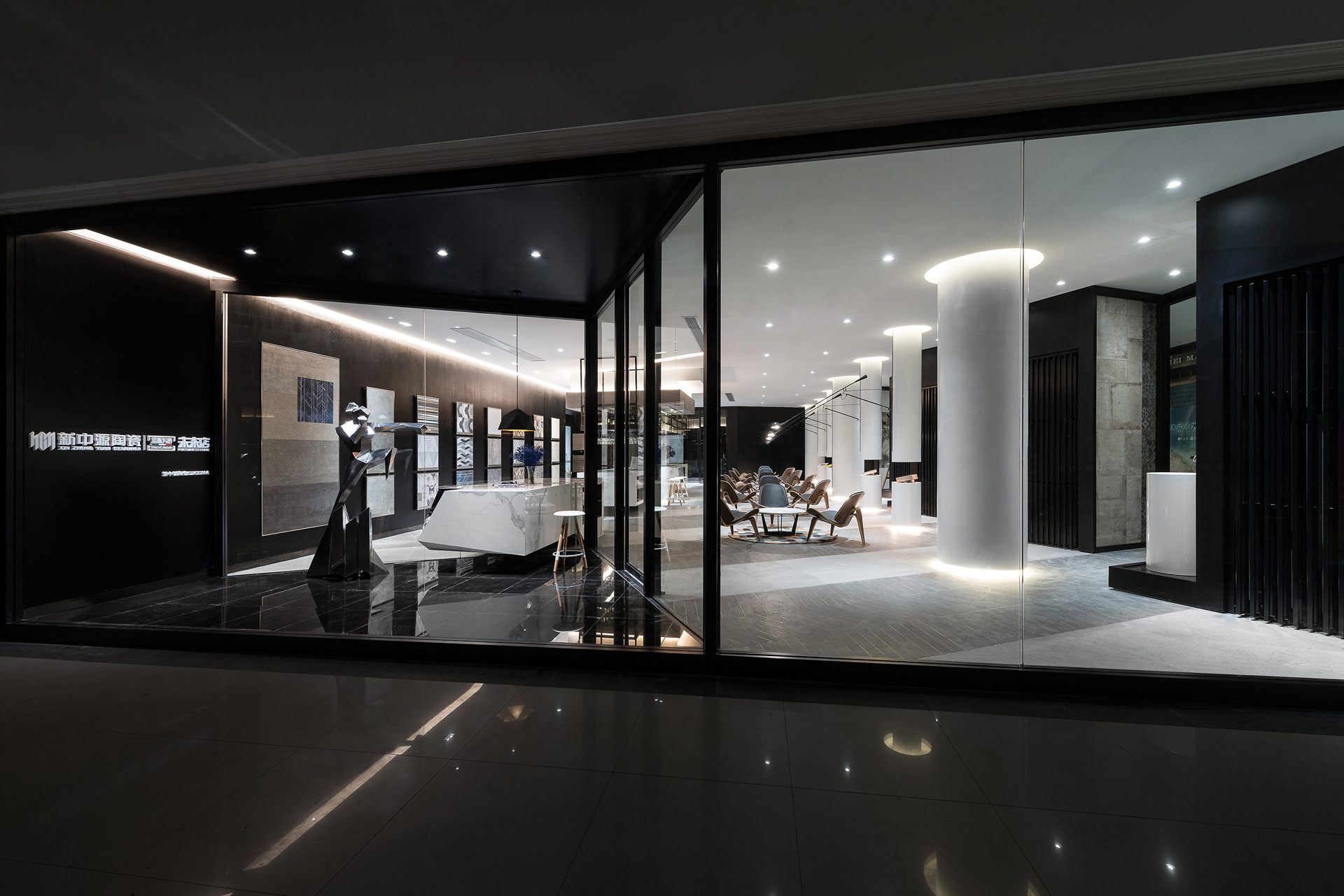
室內空間以自由平面為主要核心發展,矩形平面皆以清透落地窗包覆,位於短向的出入口,以角形內退空間做為室內與室外的中介場域,藉此提昇空間品質及接納可能的事件(event)。位處中央的長形吧檯,是櫃台、似書坊、如餐桌、為裝置,同時與對側的虛實共構的柱廊,為偌大的室內建構出清楚的軸線關係與空間次序。以吧檯、咖啡座桌椅營造的閒適場域內,我們企圖透過充滿文生活感的氛圍,讓磁磚的展示、販售,由單向度的直覺式靜態呈現,退隱至以「文化生活」為主體的空間架構中,讓整個的場域更具包容性及延展力。
Free plan as the main core development of the indoor space. Rectangular plans are covered with clear ceiling windows. An angle retreat space, located in the short side of entrance, as an intermediary area for indoor and outdoor, enhances the quality of space and to accept possible events. The linear bar counter, located in the center, as a counter, bookshelf, dining table or equipment, constructs a clear relationship between the axis and spatial order for the real and decorated columns on the opposite side. In a leisure field creating by bar counter and cafe tables and chairs, we attempt to display and sell tiles by the one-dimensional intuitive static presentation via an atmosphere full of cultural life, retired to the "cultural life" as the main body of the space structure, so that the whole field is more Inclusive and extensible.
輕重之間-以輕盈材質、淺色基調建構層次豐富的外觀
Relative importance-creating levels of rich appearance by light and light-tone materials
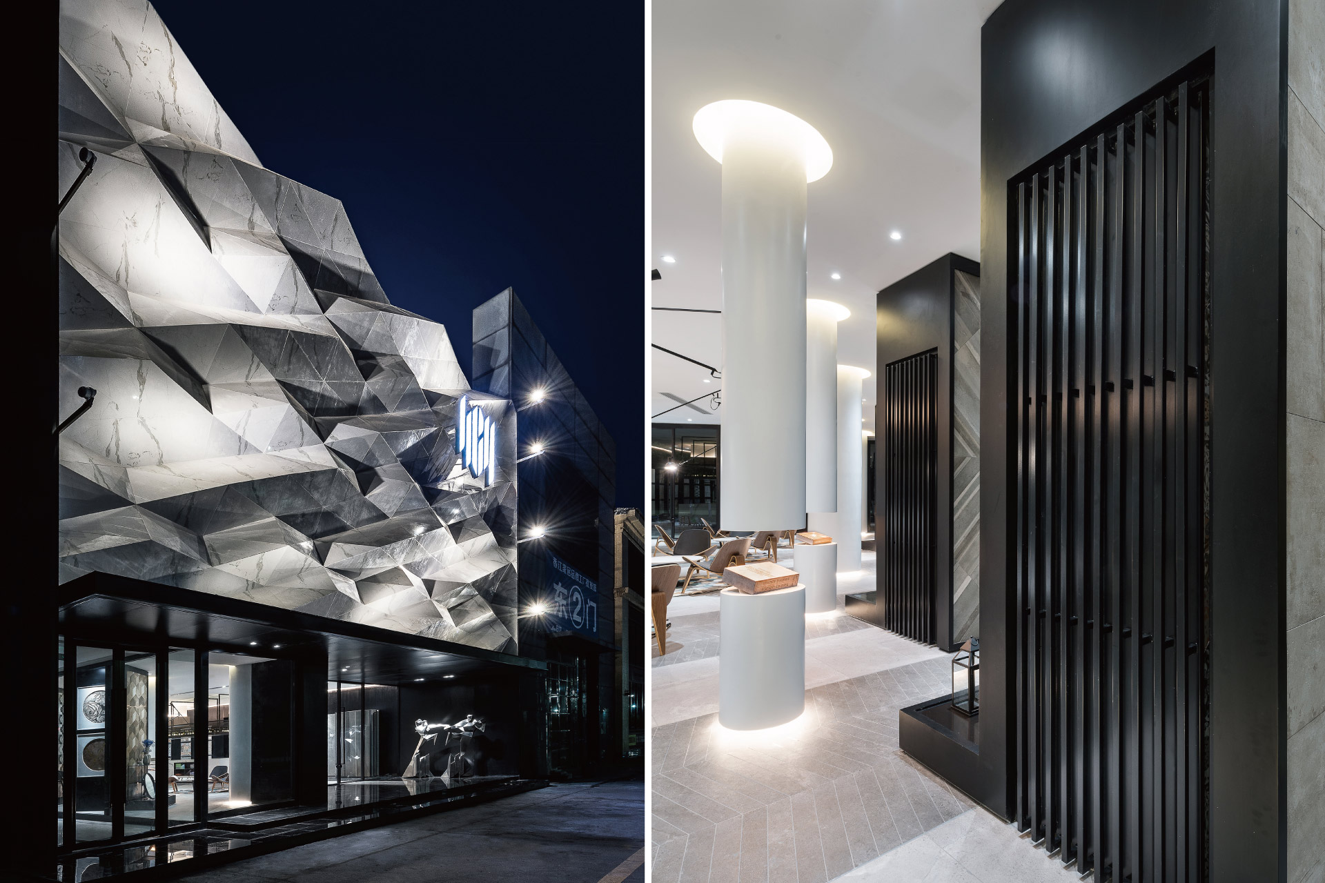
在高15米的正立面,設計以淺色薄磚為基底,建築物自周遭深色調主體的厚重氛圍中烘托出來,藉輕盈材質堆疊的穩重實感,以數位運算的模矩化拼貼與高光面及啞光面的錯落搭配,結合兩側鏡面收邊,在建構豐富的層次之餘,亦巧妙地將商標圖騰蘊含其中,創造虛化與簡化的立面敘事性。
In the elevation of 15 meters, designed with light-colored thin brick as the base, the building is contrasted from the dark surroundings of the main body, by stacking steadily of light materials, by modular collaging by digital arithmetic and misplacing of high glossy and matte finishing, and by combining with both sides of the mirror trims, in creating rich levels, cleverly containing the trademark totem and creating the burring and simplified facade narrative.
複合之盒-結合多元呈現的磁磚展示盒
Composite box- the tile display box combining with multiple presentations
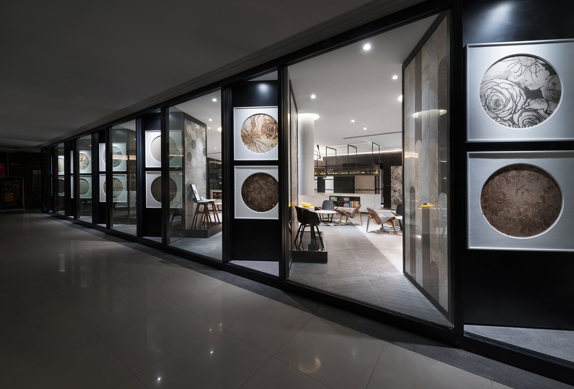
臨長向外側的五個展示盒,作為主要的商品展示區域,在展示盒的四個不同立面,分別以大型P1.8的LED面板牆、抽取式的實體材質展示櫃、與藝術家結合的磁磚藝術展示台,將磁磚展售所需搭配的物件,以不同載具、異業結合的方式,多元紛呈地濃縮展示盒中。同時,也藉由對外的展覽檯面,營造出如同走入美術館般的感受。這是一個感受生活的場域,商品展示被以多變的樣貌隱身其中,以空間設計創造全新的銷售體驗。
Five display boxes along the outside long direction, as the main product display areas, in the four different facades of the display box, respectively use large amount of P1.8 LED panel wall, extract style of solid material display cabinets and artistic tile showcases working with artists, to display the objects which needed to be matched and to concentrate enrichment in the display box by combining different ways. Simultaneously, through the public exhibition table, creates a feeling like into the art museum. This is a field of experiencing life and the merchandise display is stealth in variety of ways, creating a new sales experience with space design.
